Showing posts with label United Kingdom. Show all posts

Saturday, 12 March 2022

Light Art by Yards in Lumiere Durham

Durham is a city straight out of a nostalgic TV series. Tiny brick houses gather around the towering cathedral, out of proportions for a village this small. The streets in the old part of the town are appropriately serpentine, swirling around the many kinds of yards of the town. Those beautiful yards are what I remember the most from my visit to Lumiere Durham 2021. There were all kinds of yards, the hidden backyards and gardens, the public front yards, the posh courtyards and even a gloomy graveyard. And a meta yard. Even the venues that were not actual yards, often felt like playgrounds, with people climbing on, doodling with and sitting on lights, having a good time together. 

A local contribution

Peaceful backyards

The one thing not familiar to light festivals was the calmness of some of the venues, most of them backyards hidden from the bustle. The festival managed to create intimate experiences in spite of its magnitude, especially in the spots further away from the center.

"Well, that doesn't seem like much" was my Mom's response as I showed her a photo of Kaleidoscope by the Northern Butterflies, and that's true, kind of. What really made the difference, was the soundtrack, where people told what the garden means for them. After being told this, my Mom, an avid gardener, approved. So did I. The warmth and humanity of this piece of art went way further than a light show.

The Lines by Pekka Niittyvirta and Timo Aho, with white bright line marking the expected level of water in the future, was meant to be seen from a distance, from the other side of river Wear. Luckily, I got lost, and got to see it more up close. Being alone by the artwork was an intense experience, for artistic reasons, mostly. Also, I was afraid I would slip and fall down the hill and the crowd on the other side of the river would laugh at me. Anyway, this was one of my favourite works: simple, beautiful and political. I've seen other editions of this piece in flesh and photos and I have to say it is demanding of its environment. The darkness and closeness to water were a huge plus, but distance from the (non-lost) audience didn't quite serve the piece. There's a web based art project by Niittyvirta and Aho, called Coastline Paradox, which has a connection to the Lines series. Go, check.

Vegetables, a thing to be taken personally

A tad more sinister garden

Scattered Light by Jim Campbell was another of my favourites. A matrix of tiny bulbs, with a subtle flickering, glowed calmly in the dark like a specimen of starry sky. Every now and then a character made out of shadows fled stealthily through the artwork, but one had to focus to notice that. It was refreshing to see that kind of matrix of lights used to create vague and ambiguous forms instead the usual strict geometrical patterns. 

Tim Etchells's Shifting Ground joins the well-established tradition of neon letter artworks. The text in question is the title of the work, installed on top of the majestic (in Finnish scale) Miners' Hall. The artwork is simple, to the extent that there was a person exclaiming to the audience that what we see is all there is, just the text, no flashing to be expected. I have to disagree, though. It was not just the text, but the environment together with it, that made the eerie and impressive piece complete. Especially the building, of course, but also other objects close by. Like the statues, that were quite out of ordinary, basking in the red light.

It was too difficult to have a proper photo of the shadow person,
so here' s a fleeting flesh and blood person instead

"Miners' hall" is a give-away of the themes of the artwork

Insert a red-light-district pun of your choice


Meet And Greet in the Front Yards

Front yards are the place to say hello to passers-by and share the latests gossips, err... news with one's neighbours. There was a bunch of artworks that either handled this theme or made people practise it. The most obvious example being Dominik Lejman's When Today Makes Yesterday Tomorrow, nonchalantly projected on the library's wall, depicting people walking by, shaking hands. In addition to being quite a relieving image in the age of no touching, it also reflected the real people walking by in a most interesting way, becoming a thought bubble or a meta level of a kind for the crowds.

Lightbenches by Bernd Spiecker have some history behind them, as well. One example being Stefan Sous's UVA-UVB, benches installed in a park in Düsseldorf, made of fluorescent tubes (with some extra structure, I believe) in the beginning of the millennium. Also Spiecker's benches have become permanent items, in Durham as well as in London, that I know of. I've been using these benches in my light art lectures as an example of a very simple interaction, meaning basically just sitting on art, but as I monitored people I saw it was more than that. The bench was an item that brought people closer to each other in a concrete way, even if it was just to cluster for a group photo. And sometimes smooching. It was so nice that I forgave the use of the ever-awful rainbow effect in the chancing colour of the bench.

Liz West's Drop Scene shows how light can really make a difference, by a simple gesture of colouring the light pouring from outside of the garage-like tunnel. Now, that's a real magic of light: making people gladly hang out in a gloomy underway!

A town meeting on two levels

A basic interaction about to happen

Respectable people hanging out in a tunnel

Courtyards 

Courtyards are places to put on one's best face. To show how culturally sophisticated one is, how well read, and how poised to be charitable and benefit society. The styles in the courtyards of Durham were quite different from each other, though. The Castle was adorned with lines of poetry in Anthology - Into the Light by Amelia Kosminsky and several poets, commenting the current world in a subtle and simple way. In Our Hearts a Blind Hope by Palma Studios, projected on the Cathedral, on the other hand, went full throttle with Covid sentimentality, including a sea of candles and a rising phoenix in the imagery. Chronos by Epsztein and Gross, projected on Ogden Center façade, was a cavalcade of all things scientific, from planets to beating hearts, with an expected soundtrack and lecture-like punctuality. 

Light writing on the wall

The spectacle on the Cathedral came as no surprise

University / Universe - can't be a coincidence!

City Center Playgrounds

The most colourful and interactive artworks were centred around the shopping and restaurant area of the town, and fitted the natural hullabaloo pretty well. It was nice to see people climbing objects, doodling on the ground and seeing colours, mostly sober. 

Halo by Illumaphonium, I later learned, had a sound element in it, but since people were climbing on the piece, squealing with joy, I totally missed it. Colour by Light by Floating Pictures was super simple: one could draw strikes of colourful light with one's flashlight. The end result wasn't exactly sophisticated work of fine art, but it was super fun to do! The most eager artists were lying on the ground to get a closer touch. A friend told me.

Imminence by Novak is familiar to me from its London run, where it appeared more serious, in spite of colourful and cartoon-like imagery. Reason being less people per square meter, meaning better visibility for the image to be seen, I guess. In Durham, the message of nature getting ruined was somewhat transformed into a colour-bathing experience, which is not a bad thing, either.

A Jetson family playground

DIY abstract expressionism

Paint it anything but black

Finally, I found myself standing in line at a graveyard. This is not a gloomy metaphore, I was waiting to enter a church with an artwork in it. It tells a lot about the festival, that even this felt cosy. But even cosier was City of Light, City of Stories, a project lead by Po Jocock. Local communities had built lanterns in shapes of buildings and created a whole new city. Well, almost new: even though the buildings were described as imaginary, I could recognise some of them. This yard in a yard was, in my opinion, the one piece that best represents the warmth of the festival.

A metayard


Other people writing about Lumiere Durham 2021

Katy Wheeler / Sunderland Echo: First look at spectacular Durham Lumiere 2021
Hello Freckles: Durham Lumiere 2021

****
Spectacular thanks to Niilo Helander Foundation, that has made possible my Grand Tour of Light Art, including the visit to Lumiere Durham.


Tuesday, 15 February 2022

LUX: New Wave of Contemporary Art

There's not that much of LUX in the exhibition, but all the more of transitions, mirrors and technical details.

LUX: New Wave of Contemporary Art at 180 Strand, London
13 October 2021 - 20 February 2022
Curated by SUUM Project in collaboration with Fact and 180 Studios

Lux, as in Light, as in “Light as subject matter, a thing to explore and shape”, as the information text told us, was not exactly subject matter or explored nor shaped in the exhibition. LUX was more about video art, new kinds of screens and digital technologies and how wonderful they are. Light is a part of that, but in a form of a technic, not content. It is not the worst crime in history to name an exhibition ambiguously. Except for definition wise. I mean, who would like to go to a happening, advertised as a light art exhibition, and be forced to see video art instead! The horror! 

Luckily, the video art in question was pretty ok. And there was also some light art. 

½ pcs of light art

Es Devlin’s Blueskywhite is a diptych of light art and video art. At first look it much reminds me of ripped canvasses by Lucio Fontana. Even though the two look quite different, the idea of a slash is there. In this case, it is a bright light, bursting from a narrow whole in a partition. After admiring the composition of this seemingly 2d-ish artwork, I realized it’s a walk-in light art installation, leading to the video art part of the piece, with black, white and clouds, describing the possible change in sky colour and reasons for it. Simple, clear and beautifully executed.

A slash of light

Darkness is total in Blueskywhite

Surprisingly, the artworks I enjoyed the most were the ones furthest away from abstract light. Solemnly gospel-like Black Corporeal (Breathe) by Julianknxx dealt with breathing on both physical and mental level, peacefully and desperately. An extremely beautiful piece of art, with assertive content. 

I’ve seen Hito Steyerl’s This is the future previously at the Venice Biennale, where it held a larger space. Even though the artwork itself was just as wonderful in this crampier site, with all the flowers and dashing to and fro in time, I quite missed the beautiful light pools of Venice version, reflecting from the plastics screens. Accidental light art at its best.

Breathe is an extraordinary piece of art

An old friend from Venice

Mirrors mirrors over-all

Space bending is an expression used a lot these days. In this exhibition, it meant mirrors. There was Carsten Nicolai’s unicolor, a study in light theory, where mirrors on both sides created an infinite space. Then there was Cao Yuxi’s Shan Shui Paintings by AI, where mirrors on both sides and above created an infinite space. In Refik Anadol’s Renaissance Generative Dreams mirrors everywhere created an infinite space. 

Ever changing colour combinations creating a fleeting colour theory lecture

AI creating fleeting Shan Shui style images

Colourful nonpareils creating fleeting renaissance images

In a’strict’s Starry Beach the mirror effect was done with projections. But it did give a sense of an infinite space as well. The goal of a’strict has been to create a beach for those who haven’t been able to travel to a real one for some time now. In the artwork, the essence of a beach is distilled into universally recognisable sound and waves. It took me some time to realise that the waves were far from realistic, since the mass and movement was captured with such skill. Even though Starry Beach is probably not the most complex artwork in the exhibition, it did give me a sense of sweet melancholia and meditative joy.

Just like not at home!

Creatures in transition

Transition was a smash hit in the theme pool of the exhibition. Cecilia Bengolea’s Favorite Positions, portraying a computer-generated feminine body as a transparent vessel of unknown liquid that drips from her contours, the transformation is mostly about positions. And octopuses. In Bestiaire, from the same artist, a similarly glossy body transforms into variety of fanciful creatures, retaining the theme of positions as well. 

One of the favourite positions

Another position, with more colours

Transfiguration by Universal Everything is way more straightforward. A creature walks in a glossy-floored void to an unchanging beat and turns into different kind of materials from fire to goo to rocks to ice and everything between. The thumping soundtrack alters accordingly. “What a banal spectacle” was my first thought, but soon I realised I had been watching the thing for quite some time, mesmerised. A more poetic version of transforming, Morando by a’strict depicted images of blooming and fading peonies in transparent screens. You know, circle of life and stuff. Also, a lot of technical details. 

The goo phase. One of them.

See through peonies and screens


Textual nagging 

Technical details were abundant in most of the information posters and I wonder why do I need to know that stuff? The peonies are just as beautiful and engaging, no matter what’s the specific type of the screen used. The answer may lie in the list of sponsors, but I've noticed this phenomena in non-sponsored exhibitions, too. Well, at least this time no-one wanted to tell me the exact amount the led lights used in an artwork, which seems to be Very Important Information in a lot of light art festivals.

iart Studio's Flower Meadows is created using flexible OLED displays

The poster for Random International’s Algorithmic Swarm Study was rich with words like algorithm, processes and software, which led me to expect a little more than a group of 3d coins in the air. Mind you, I'm not yearning for a flashy spectacle here, but some sense of what is this and why is it, in the first place. Same applies to information text for Je Baak’s Universe, in a way. Lots of big expressions with  no connection to the artwork (that I could see). But maybe this more a question about texts than artworks, the former being quite neglected area in the new waves of contemporary art.

Swarm in action

Amusement park in a void


Other people writing about Lux

• Julian Stallabrass / New Left Review: Sublime Calculation

****
Spectacular thanks to Niilo Helander Foundation, that has made possible my Grand Tour of Light Art, including the visit to LUX.

Friday, 4 May 2018

Spots for Staring in London

London, UK, April 29th to May 2nd 2018 and several previous dates

After Mexico, I firmly decided to stop traveling for a while, since my finances had a near death experience. Then a friend from London duly noticed that we hadn't seen for ages and I immediately started browsing for tickets. Which were on sale. Oh, well.

Hooray! I'm in London! Said my wallet never!

So, what to do in London? Whatever you like, it's all there. Personally, I like to observe. I'm not as talented as Kim Jong Un, but I admit that a lot of my travel activities include some looking, staring even. Here's some of the places I use for specific staring purposes in London.

Staring at People: Old Compton & Frith / Dean street corners and Golden Square

Old Compton Street is optimal for people watching: not too much traffic, narrow enough street to see everything, lots of leisurely people to watch, including good amount of eccentrics to keep it interesting and even better amount of cafés with purpose built people watching tables and terraces, especially at the corners of Frith and Dean streets.

People watching at the terrace of Balans Soho Society.
Also recommended for the food.

Another good place for people watching, especially lunch time is Golden Square, also in Soho. You can pick lunch or coffee from the nearby cafes and sit on one of the benches for consuming it. Nordic Bakery is a good choice, even though they serve their laskiaispulla with jam and not with marzipan as is right. The marzipan/jam question is one that divides the Finnish nation, so that you know. Some are ok with both, though. Sluts.

Quick and slow lunches at Golden Square

Other writings on people watching in London: Londonist's list of cafés and bars, Foursquare recommendations

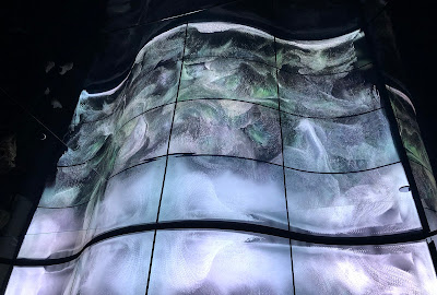
Staring at Shoes: Selfridges Shoe Galleries

The visit to Selfridges department store at Oxford street a couple a years ago was a pettymys (disappointment in Finnish). But even when bad, the Selfridge's shoe department is an experience. And when it's good, it's ecstatic, even though I'll never have the means or calf muscles to wear most of the shoes there. Yes, you have the boring nude heels, too, but the main attraction are the flashiest, most colorful and imaginative shoes of top and upcoming designers. The further you go, the more interesting shoes you'll find. The decoration is equally flashy and changes according to season. I mean, come on, who wouldn't love a two meter tall mirror ball shoe?

My previous reports on Selfridge's Shoe Galleries (in Finnish): Kummat kengät: May 2016, September 2013

Sophia Webster's trademark butterflies
As soon as these shoes found out their prices, they fainted.

Staring at Windows: also Selfridges

These guys sure know what to do with a display window! They're practically pieces of art, I'd say. The lighting is usually an important part of the composition, so you should see them nighttime. Also, way less people then, Oxford street becomes your own private art gallery.


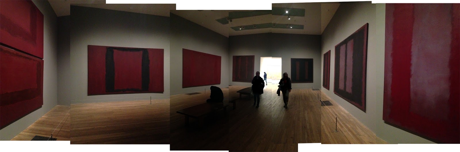
Staring at Art: Rothko Room in Tate Modern

There are a lot of options to see art in London, but this is an exceptionally good place to stare at it. Dim lights (demanded by the artist), benches at an optimal distance, meditative abstract art requiring some staring to really get something out of it.

The so called Seagram series, originating from the 50´s,  was originally intended to the Four Seasons hotel's restaurant in New York's Seagram building, but the artist Mark Rothko (1903–1970) withdrew from the commission after finishing the paintings, possibly realizing that the luxurious restaurant was way too shallow environment for them. For me, the weirder part is why he accepted the commission in the first place, being quite a leftist person and the restaurant being everything but. My favorite version of available explanations is that with his paintings, he wanted to ruin the appetite of the rich diners. A visual revenge, so to speak.

Anyhow, by the end of the 60's, he decided to present the series to Tate, with strict terms that the series must always be exhibited together, in a certain kind of room, in a dim lighting. The cargo containing the paintings reached London the same day as did the news about Mr. Rothko's suicide.

More on the Rothko Room: Darren Lyons in Abroadblogs


Staring at Tombstones: Highgate Cemetery

Ok, this a short term staring only, since the West Cemetery of Highgate Cemetery is to be visited in a guided group. As we were starting the tour, the guide reminded us to keep the pace and not be the one everyone else had to wait for. I was so sure that I wouldn't be one of the stupid tourists the guide referred to, but there were just too many beautiful, slanted tombstones and I obviously had to take picture of every single one of them. I could use them in a book cover! Or a birthday card!

More info on Highgate: Highgate's Lost Girls by Spamosphere, BBC on tombstone tourism


Staring at Scenery: Sky Garden

Sky Garden is a combined bar/restaurant area and a 360° lookout spot near Monument. The garden is an area of plants and bushes, but the main thing is the view here.

The entrance is free, and you can either book a visit beforehand (if you're quick to reserve tickets) or you can just walk in during certain times. Well, not just walk in. As I saw the lines ten minutes before the 18:15 walk in time's start, I was about to turn around and climb on a ladder instead or something. Luckily, my company insisted we stay and the queue turned out to move quite swiftly. The view is fantastic for staring and after visiting, you can tell your friends that you've seen most of the sights of London.

For properly staring, not just looking, you should be among the first visitors at 18:15 and rush to Sky Pod Bar's plastic sofas right in front of the first window you'll see. Obviously, via the bar counter, since these are customer seats. Yes, it's a horrible sacrifice to drink a glass of bubbly just for the view. You can wander around for the whole 360° later, first things first.

Other people tell about Sky Garden: Tuula's Life (in Finnish), Charlotte Brown, My Baba


Staring at City: Buses

Obviously, you need to go to the upper deck for this, preferably to the first row. Wobbling through City's narrow streets between high, distinguished buildings is an experience, and other parts of London, too, are well observed from the high angle the bus provides. Mind the rush hours, though, or you'll end up staring at St. Paul's for half an hour as I did. I'd recommend east to west direction in the early afternoon, since the light is at its best angle at that time. If it has been raining, as it often has, all the better!

Yea. There it is. Still.
And oh, do you know that you can pay for the trip with your regular contactless card now? The good'ol Oyster card is becoming obsolete, which sucks since I have three.

Watching the fleeting buildings is like
a slow, cubistic Monty Python animation.

The rain may make the scenery very gerhardrichter
Related Posts Plugin for WordPress, Blogger...