Showing posts with label Netherlands. Show all posts

Thursday, 17 March 2022

From dusk till almost dark in Amsterdam Light Festival

Is darkness really needed?

The tenth edition of Amsterdam Light Festival in 2021 was defined by Covid restrictions, to the brink of madness. At least during my visit in early December. I’m all for vaccinations, masks, distances and all that stuff, but what is the point of restricting an outdoor happening? And even yet, by cutting opening times from the dark end? The festival closed daily at five pm, so there was dark enough for a half an hour to see the artworks properly. As clock turned five, I expected to see at least some civil disobedience the Netherlands is famous for, but no. The works just closed. Where’s the resistance!

Oh, bollocks! 
Moonburn by Stichting Barstow was not too hallucinatory in daylight

On the other hand, not every light artwork needs total darkness. In fact, I often prefer watching outdoor pieces during dusk, while there still is some light left for the environment as well. It reduces the sometimes-strong contrast and I get to see more than just the afterimage burned to my middle-aged retina. 

So, let’s try to be positive here: how the artworks of ALF gained from (some) daylight? As said before, the dusky time slot is a short one, and the light changed all the time. So, no pure impartiality to be expected, just a few examples.

Hello Duskness My New Friend

There were surprisingly many artworks that either didn't suffer or even had some benefit of the daylight leftovers. Neighborhood by Sergey Kim was definitely one of those. The hanging laundry, an everyday item par excellence, became even more everyday-ish as its everyday surroundings were visible and became part of the artwork. Bunch of Tulips by Koros Design looked just as souvenir-like in light as it did in dark, and the surrounding Amsterdam, still visible, supported the theme of tulip craze.

Glowing clean laundry

Indeed, the tulips did change their colour,
running through the whole spectrum

1.26 Amsterdam by Janet Echelman was a real surpriser. I would have though that the huge net would all but disappear without a near absolute darkness, but no. The artwork might have lost an illusion, but gained another kind of vacillating beauty instead. Mr. J.J. van de Veldebrug by Peter Vink, with its linear, architectural approach, glowed in the thickening blue evening light like a drawing in AutoCAD. Most suitable!

Minuten in Blauw by Kira Ressing, Kyra van Baar & Naomi de Bruijn takes its inspiration of the moment of falling darkness, so it's no surprise the moment in question suits it superbly. I had a coffee break just to wait the sun go down a little bit more and during those fifteen minutes the change was essential. As I walked past the artwork some hours later, it was almost too dark for it, I think. The subtlety of the differences in light levels was gone.


Layers in scenery

A 3D light drawing

Amsterdam's windows

Alaa Minawi's My Light is Your Light is a winner in any light. It's bright enough to be (barely) visible even in full daylight, beautifully glowing in dusk, and calmly articulates the outsiderness of the characters, as they continue their eternal walk in the darkness, light shining from other people's homes. 

Loneliness is tangible also in Pas encore mon histoire by Vincent Olinet, but even the hue of solitude changed according to the level of darkness. The first time I passed the artwork it was still quite bright and the floating bed looked forgotten and misplaced. The next time, in dusk, it was romantically dwelling in its own dreamworld, as the light inside it glowed delicately and the setting daylight gently revealed the bed's pastel tones. According to a lady I had a discussion with about light art on the bank – as one does – who walks pass the bed every evening, it becomes most haunting, even hostile, in the darkness. 

I've seen these guys in so many cities,
hope they'll get to their destination one day

The bed in its romantic phase

Then there was the peeing... fishing Darth Vader, that totally gained from full daylight, which made the dark character well recognisable, even seen through a rain-beaten boat window. It's clever from Streetart Frankey to name the piece Darth Fisher, just to make some things clear.

The glowing rod of Darth

Just no

In case we will be meeting regulations again, which I fear is not too whimsical a prediction, I'd like to remind that not all the light-artworks are suitable for diurnal use. Some are, conversely, ultimately not. See for yourself, and if you are the one making decisions about the regulations, think again.

Drawn in Light, just without the light
Ralf Westerhof

Starry Sky, just without the stars
Ivana Jelić & Pavle Petrović

Meisje met het zwavelstokje,
stokje not shining like a beacon
Studio Aldo Brinkhoff - Stichting Nieuwe Helden


Other people writing about Amsterdam Light Festival

• Shirshendu Sengupta: Amsterdam Light Festival 2021-2022

Touristy Tip

The place I stayed in Amsterdam is worth a mention. Sweets Hotel provides bridge houses to stay in, all different, scattered around the town. I stayed in the Meeuwenpleinbrug house, in Amsterdam North. Most spectacular! I could have watched the scenery for hours. And did. It was like a grown up version of the huts I made while a kid. A very own house, hovering above the water. Just wonderful! And with some lucky timing, also almost affordable.


****
Spectacular thanks to Niilo Helander Foundation, that has made possible my Grand Tour of Light Art, including the visit to Amsterdam Light Festival.

Monday, 29 November 2021

Rhymes with WOW

GLOW Eindhoven is one of the biggest light art festivals in Europe, reaching its 15th edition i 2021. There was something old, something new, something recycled and something cold flickering blue.


Lights! Colour! Prepare to be amazed!
Water Wall by Aquatique Shows

Decentralized light art in a city with electrical history

The city as a venue does mean a lot to the overall ambience of the festival and so does the route. Eindhoven does have a place in history of lighting, since it’s The Philips City and you should visit the museum. But it is not the prettiest city of the Netherlands. The route did, however, show different and quite interesting areas of Eindhoven. This year, the artworks were scattered all around the city, in three main clusters with a couple satellites added. I had three nights to spend, and I do say it was not too much – even though I skipped most of the satellites. There was some extra walking (and, occasionally, fence hopping... a friend told me), since the map didn’t show which areas were fenced and where to get in. There is some room for improvement there.

The bold buildings of the city were used well as material for artworks. My absolute favourite was Eye of Atlas by a team led by Philip Ross and Max Frimout. The existing lighting system of the Atlas office building was programmed for light to breathe, linger and slide in the building, with an immaculate sense of rhythm. The Rainbow (a tad obvious name, I'd say) by Rik Verschuren and Tim van Stiphout was a beautiful display of colours, but a less daring bet in the inhouse light game. In this case the colour scheme was an argued decision, not just running through the whole colour spectre because you can, I'm happy to say.

A chord in the Eye of Atlas symphony
A colour variation of Rainbow

Laser tag war with a church

As with pretty much every festival, GLOW had a large façade projection mapping show. The canvas was a church, a very popular choice in projection mapping. Domus Luma by Yann Nguema had quite an organic flow in the animations, which made a big difference compared to the usual engineery punctuality of most projection mappings. Even though there was fair share of flying bricks and crumbling walls, there also was some unusual stuff, like lasers combined to projection. It’s much more fun to see a church falling apart, when it’s done with lasers! Another trend I’ve noticed in projection mappings: a human-ish character appearing for no apparent reason. Here it was a shiny hunk with a huge banana on his shoulders. 

That must be one heavy banana.

Topical lanterns

Self made lanterns forming a collective artwork have, indeed, become quite inevitable in light art festivals. I feel really at home here, since I curated the Lantern Park of Lux Helsinki festival for six years. So, guilty as charged. Of course, Lux Lanterns is the bestest of best lantern collection, but it is nice to see other people doing just as crazy stuff elsewhere. In Eindhoven, however, I was getting desperate not to find any lanterns at all, but finally found some – in a bar! How suitable, since the lanterns have been made by students. Points to Eindhoven for placement and a supportive theme!

The New Mutants lantern project was led by Har Hollands

From big and bold to blunt and blue

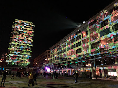
I remember seeing my first colourfully lighted town square in Pécs’s Zolnay light festival some years ago and I remember thinking wow this is something different. I was wrong, of course. Many festivals have their own version of this theme, and I cannot complain, it is very nice indeed. In Eindhoven the square was huge and there was a building to go with it and there was a colourfully lighted industrial space as well! Overwhelming!

Footprint at Ketelhuisplein was a project led by Hugo Vrijdag, with kids of Eindhoven, who drew the images seen covering the area. The artwork is a comment on the Dutch ecological footprint, and I'm sure the electricity needed for the piece is produced by windmills. In a weird way, Footprint managed to be cheerful and dystopian at the same time. It must be the combination of flowers and eerie green light.

Ode to Light (oh, come on, have some imagination with the names!) by Daniel Margraf was more evidently merry. Bright colours, fairytale characters and tropical birds transformed the industrial space into an enormous eye candy store. What a stark contrast was the next artwork, Falsche Frage by Charles Vreuls! With its blunt blue-white warning lights flickering almost violently in silence, it certainly was not pretty. But it was impressive. 

A green Footprint

Industrial hall in bloom

These lights would probably scare the moths away

Christmas is coming

The line between decorational lights and light art is blurred, especially at light festivals, especially before Christmas. Valerio Festi's Porte Celesti, with 25 light gates around the city are very much based on the baroque aesthetics of abundance and ornamental. I would rather call them decoration, with a strong skill in craft. Mind you, decoration is not a bad thing, when done properly. Here it most certainly is.

A good example of meticulous craftmanship
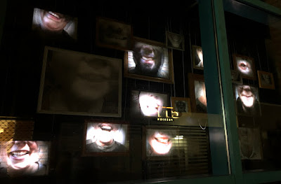
Different kinds of site-specifity

The Window Expo was a great idea to involve local organisations and businesses, I think. Since the artworks were often quite small, it became a kind of treasure hunt to spot them in the shops' windows. The artistic level was varied, yes, and often the artworks didn't quite stand out from the usual window display, but that was maybe not the main point here. Muziekgebouw's Hahaha (by Marijn Smits, Laurie Roijackers, Isis Boot, Luuk Thijssen and Mandy Ouderland) was one of the tops of this entity, I think. 

Gijs van Bon's Ping is a product of GLOW Eindhoven 2018, now renewed and replaced to the worksite of Nanjing Pavilion. Whether the worksite of the venue is genuine or specially staged for Ping, it matches very nicely with its board constructions and makes the artwork even more site-specific than originally. The artwork first hit me like what the hell is this raving hodgepodge? But while wondering that, I grew quite liking the invisible high speed roller coaster, roaming around fiercely, hitting the wall like flaming Harry Potter, very late from the Hogwarts train. 

Smiles of Endhovians in Hahaha

Light hitting the wall in Ping 

Moving strictly and broadly at the same time

All in all, the festival was pretty much what I expected and what light art festival usually are: things of beauty, joy and amazement. The search for WOW effect was evident: most of the adjectives in media material were likes of stunning, incredibly impressive, huge scale, gigantic, beautiful effects and images, wonderfully enchanting and so on. You get the picture. 

The slogan for the year was "Moved by light". Yes, there were some artworks that encouraged actual moving, and yes, light moves us also on emotional level – but that goes with all light, not just the artworks in GLOW. This is an issue with themes: if you have a specific one, it might prove difficult to stick to it and if you don't, the exhibition may end up amoeba-like mishmash. Not that anyone cares, except some deranged curators maybe. Often, I think, the themes are picked just because you have to have one, without really thinking about the content. 

But this is material for another article entirely.

People moving vigorously


Other people visiting Glow Eindhoven

Tripadvera (in Dutch)

***
Unbelievably big thanks to Niilo Helander Foundation, that has made my Grand Tour of Light Art, including the visit to Eindhoven, possible.

Wednesday, 26 February 2020

Trajectum Lumen: Orienteering by Light Art

Trajectum is the ancient Roman name of Utrecht, and Lumen is the unit of luminous flux. And a metabolism hacking device. And a Russian rock band. So that you know. Trajectum Lumen is a light art route meandering through Utrecht's ancient Roman center, luckily consisting of quite different light art works than those favoured by ancient Romans, especially emperor Nero. Like, flaming cities and humans.

The given estimates of the time needed vary between one and one and a half an hour, plus a likely visit to a bar, but I'd recommend at least two hours. And a visit to a bar.

Light Art Inside, Outside, Upside Down

I was a tad prejudiced when entering Erik Groen's Tunnel, since in the publicity photo it looked like another spectrum-wanking wondertube, of which there are way too many. I mean, we all know that it is possible to mix all the colours with RGB LEDs, but that really is not a reason to do so. It really isn't. Anyhow, to my great pleasure the colour variety was, if bright, still actually thought of, and even the less fanciful combinations were present. One could spot the unavoidable rainbow at times, yes, but it was just another colour combination among others.


© Merijn van der Vliet / Utrecht Marketing
Jan Hein Daniëls and Willem Hoebink's installation Pausdam was possibly the most spectacle-like of the lot, but definitely not too flashy. The cool hues of blue and white alternated fluently, although a tad mathematically for my taste, kind of lacking tension, but this really is a question of preference. On the other hand the projected hare and owl had been given more time to breath, so to say, and take their time and space, which was a nice contrast to the lights' punctuality. I wouldn't call this a ghost house, but the ever so still and finally alive-coming animals really gave an eerie finishing touch to the whole.

© Merijn van der Vliet / Utrecht Marketing

Halo
by Titia Ex at Sint-Willibrordkerk was one of my favourites. Simple, beautiful and integrated to the site on a thematic level and in a most elegant way. And funny, too! I wonder if it was on purpose, but the colours of the halo perfectly matched the surrounding Christmas lights, in a very who wore it better way (the halo did).


As soon as one realises there are small orange lighted arrows in the ground, the route is easy to follow. Sometimes the art works are a tad hard to spot, but the small blue eye signs on the ground give a good clue where to stand. Before I realised this, I did roam around the Drift like a desperate human snooker ball, in search for video art by students of the Utrecht School of the Arts. Which I, luckily, did find, and I have to say, the site was genial! A perfect example of making unnoticed parts of a city visible and meaningful. But not too visible to take away the joy of finding the art in a surprising place.

@ Anne Hamers / Utrecht Marketing
The Sun Shines in and around the Buurkerk by Gabriel Lester loans the shapes of the windows of the adjacent church, err, museum, adds some colour and turns it upside down. At the first sight the work is not nearly as fancy as in the photo, but once I got the idea of it, it quickly became a thoughtful study of blurred borders between inside and outside, a statement of belongingness and surrealist caricature of a decoration. I think.

Dead lights and missing mist

The lights by the Janskerk made me go like Oh, the lights are... changing? What am I suppose to... What? Given the benefit of doubt, I believe there was something wrong with the focus of the lights at the time of my visit. Another victim of dead lights was The Fortified City by Okra Landscape Architects. Not quite as fancy as in the publicity photos, I'm afraid. Some natural/artificial haze would probably have made the day, though.


As the webpage duly warns, some of the works may not be working properly or at all – being a year round project takes its toll. I did miss a bunch of artworks either/or for being out of order or missing from the map. The two may be related. Then again, I'm pretty sure that maintenance is not lacking because caretakers are stupid, lazy and hate art. I'm betting on deficit in resources. So, whoever is funding Trajectum Lumen, give it some more tender love, caring and money, please, so it can live up to its potential.

Cosiness is the key

Many of the commentators in the social media describe the art works as "nothing spectacular", which I mostly agree on, but do not see as a problem. All too often spectacle and flashiness is regarded as imperative to light art, which simply isn't true. Trajectum Lumen artworks draw attention to the city itself, and I just love the idea of orienteering the streets by light art works! The cosy, small scale of the artworks give room for both the art and the city, without one being just a canvas for the other.

Monday, 20 January 2020

Amsterdam Light Festival: White Crispy Lines and a Spoiled Dystopia

As mentioned previously, there are more than 70 recurring light art festivals in Europe. Seen through my own and social media’s eyes, they are sometimes hard to tell apart. I decided to visit as many as I can – which may fall to anything between 1 and 70 – and see if I can find any differences between festivals.

My first destination is in the Netherlands. Amsterdam Light Festival has reached its 8th edition in 2019, with 20 art works spattered around eastern part of the city centre. The recommended route is about 6 km and a boat is the preferred vehicle. There are many companies providing tours listed in ALF's website and the prices are not too painful.

So, what is special about Amsterdam Light Festival?

1. Water

Amsterdam is defined by its canals, and somehow I'm getting the idea that the Light festival is built on the needs of boat trip providers. That’s both a curse and a blessing. The art works are designed to be seen from the waterside, which leaves the ground strollers in a weaker position, view wise. Then again, gliding among the art works is a unique experience, well worth the quite reasonable ride fee.

Even if a boat trip is one of the most touristic thing ever, (which has never stopped me from taking one), a cruise in December has a taste of adventure. Raindrops will probably keep falling on one's head, and one shall freeze one's arse off, let me tell you, so one should dress accordingly. But it's worth it! In addition to seeing the art works from the designed angle and without too many steps, there's a certain camaraderie among the fellow travellers – partly thanks to the complimentary drink, I believe. Cheers! Kippis! Na zdraví!

Blinded by the fake famousness in Feel Like the Kardashians by Laila Azra
Photo: Janus van den Eijnden / Amsterdam Light Festival

The ultimate example of the water/ground inequality is Feel Like the Kardashians by Laila Azra. Being in the middle of a paparazzi style regiment of flash lights is quite a different an experience than just standing on the pier and watch a boat being paparazzied. Then again, some of art works are well, even better, seen from the shore.

The canals play a big role in a lot of the works. Although it’s not quite clear, why butterflies would gather fluttering on the surface of a cold canal, the drowning cities, cars and lamp posts are quite spot on in the water. Another plus side: since it is difficult and even dangerous to be interactive from a boat, the festival is quite interactivity free. Which, I think, is usually a blessing.

Atlantis by Utskottet is a kind of a graveyard, where famous buildings around the world gather to drown.
Photo: Janus van den Eijnden / Amsterdam Light Festival

2. Human scale

A light art festival without a facade filling WOW piece or two might be an impossibility, but ALF comes close. Actually, it seems just as if the works were chosen based on artistic values and not on magicality, amazingness or just plain huge size or bright colours. The fact that the works, at least seen from a boat, must be fathomable quite quickly and they cannot be too big, also gives a certain continuity to the choice of art works. Unavoidably, there was one wall projection, but even that was quite abstract, no twisting towers or flying bricks around, this time. That’s not to say that all of the pieces were small, but the usual grandiose spectacle was pretty absent. Kudos for that!

The stylishly subtle projection piece The ice is melting at the pøules by Martin Ersted
Photo: Janus van den Eijnden / Amsterdam Light Festival


3. A Proper Theme

It’s nice to have a light art festival with a real and consistent theme for a change. Disruption is a well chosen one, specific enough to give the festival as a whole a structure, but still adaptive enough to include a variety of works of different styles and techniques. Disruption is not really a synonym of political, but it’s close enough: many of the pieces were quite straightforward in their social message. Climate change was, of course, on top of the list. Just as it should be. Some of the works were quite naïve and cutesy, yes, but all of them had at least some kind of a message. Like, I’ve never seen such cute 3D printed glowing wolves in a piece about the Holocaust.

A protecting wolf from the pack in Hiding in the Wolf's Lair 
by Republic of Amsterdam Radio & Nomad Tinker House
Photo: Janus van den Eijnden / Amsterdam Light Festival

Another example of straightforward political light art was Surface Tension by Tom Biddulph and Barbara Ryan, a huge progress from their work in the previous ALF edition. The aesthetics of the  naïve neon eye of the past had matured into crisp, trimmed punctuality, even minimalism, of this year’s suggestive contours of cars drowning in the canal. This piece was just as fine, if not better, seen from the pier, preferably alone. Beautiful and depressive at the same time, a perfect piece for a Finn to enjoy. The one thing I think was not needed, though, was the trick of cute neon dinosaurs turning into cars and lamp posts, as the boat got closer. The illusion didn't quite add anything to the idea and just a tad spoiled the dystopia for me. But apart from that, bravo!

Surface Tension by Tom Biddulph and Barbara Ryan was a definite highlight of the festival
Photo: Janus van den Eijnden / Amsterdam Light Festival

The theme Disruption was also understood in a more tangible way. Krijn de Koning's Nacht tekening redraw the Skinny bridge by breaking up its usual lighting and rearranging the shapes in a most topsy-turvy way. I kept wondering if the actual lighting gear of the bridge was used, but I'm betting on a duplicate. Anyhow, I guess this was the first cubistic light art work I've seen so far. Har Hollands, with his Between the Lines, used same kind of simple line aesthetics, but the approach is pretty different. In his work, the usually unnoticed structure of a crane is made visible, but not shuffled. This, I think, could be described as constructivist light art, par excellence.

Nacht tekening by Krijn de Koning breaks up the perspective
Photo: Janus van den Eijnden / Amsterdam Light Festival
Between the Lines by Har Hollands is also a celebration of the former loading area
Photo: Janus van den Eijnden / Amsterdam Light Festival

All in all

Amsterdam Light Festival has made good use of its surroundings and has a clear curatorial concept, which makes it a very well grounded and focused event. Most of the works are commissioned, so the curse of seen-before doesn't really count in Amsterdam. Of course, festivals are targeted for the large audience, so the most conceptual light art works are quite absent pretty much from every festival, but Amsterdam Light Festival has found a well balanced way between the high art and entertainment. Or, rather, a combination of the two.

AD. Empty Domination by Maria Watjer, Jasmijn Pielkenrood and Wies Brand 
is definitely of the high art section, and also another favourite of mine. 
Photo: Janus van den Eijnden / Amsterdam Light Festival

Other people visiting Amsterdam Light Festival:

• Laughing Squid: Blue Bomb Bursts Into Light Feathers While Butterflies Float Upon a Canal at 2019 Amsterdam Light Festival
• Wimmee.com: Amsterdam Light Festival 2019
Related Posts Plugin for WordPress, Blogger...