There's not that much of LUX in the exhibition, but all the more of transitions, mirrors and technical details.
LUX: New Wave of Contemporary Art at 180 Strand, London
13 October 2021 - 20 February 2022
Curated by SUUM Project in collaboration with Fact and 180 Studios
Lux, as in Light, as in “Light as subject matter, a thing to explore and shape”, as the information text told us, was not exactly subject matter or explored nor shaped in the exhibition. LUX was more about video art, new kinds of screens and digital technologies and how wonderful they are. Light is a part of that, but in a form of a technic, not content. It is not the worst crime in history to name an exhibition ambiguously. Except for definition wise. I mean, who would like to go to a happening, advertised as a light art exhibition, and be forced to see video art instead! The horror!
Luckily, the video art in question was pretty ok. And there was also some light art.
½ pcs of light art
Es Devlin’s Blueskywhite is a diptych of light art and video art. At first look it much reminds me of ripped canvasses by Lucio Fontana. Even though the two look quite different, the idea of a slash is there. In this case, it is a bright light, bursting from a narrow whole in a partition. After admiring the composition of this seemingly 2d-ish artwork, I realized it’s a walk-in light art installation, leading to the video art part of the piece, with black, white and clouds, describing the possible change in sky colour and reasons for it. Simple, clear and beautifully executed.
 |
| A slash of light |
 |
| Darkness is total in Blueskywhite |
Surprisingly, the artworks I enjoyed the most were the ones furthest away from abstract light. Solemnly gospel-like Black Corporeal (Breathe) by Julianknxx dealt with breathing on both physical and mental level, peacefully and desperately. An extremely beautiful piece of art, with assertive content.
I’ve seen Hito Steyerl’s This is the future previously at the Venice Biennale, where it held a larger space. Even though the artwork itself was just as wonderful in this crampier site, with all the flowers and dashing to and fro in time, I quite missed the beautiful light pools of Venice version, reflecting from the plastics screens. Accidental light art at its best.
 |
| Breathe is an extraordinary piece of art |
 |
| An old friend from Venice |
Mirrors mirrors over-all
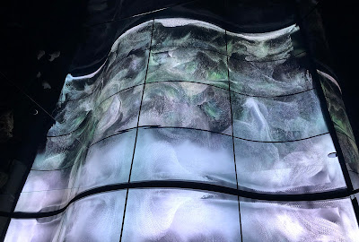
Space bending is an expression used a lot these days. In this exhibition, it meant mirrors. There was Carsten Nicolai’s unicolor, a study in light theory, where mirrors on both sides created an infinite space. Then there was Cao Yuxi’s Shan Shui Paintings by AI, where mirrors on both sides and above created an infinite space. In Refik Anadol’s Renaissance Generative Dreams mirrors everywhere created an infinite space.
 |
| Ever changing colour combinations creating a fleeting colour theory lecture |
 |
| AI creating fleeting Shan Shui style images |
 |
| Colourful nonpareils creating fleeting renaissance images |
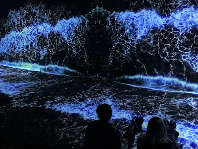
In a’strict’s Starry Beach the mirror effect was done with projections. But it did give a sense of an infinite space as well. The goal of a’strict has been to create a beach for those who haven’t been able to travel to a real one for some time now. In the artwork, the essence of a beach is distilled into universally recognisable sound and waves. It took me some time to realise that the waves were far from realistic, since the mass and movement was captured with such skill. Even though Starry Beach is probably not the most complex artwork in the exhibition, it did give me a sense of sweet melancholia and meditative joy.
 |
| Just like not at home! |
Creatures in transition
Transition was a smash hit in the theme pool of the exhibition. Cecilia Bengolea’s Favorite Positions, portraying a computer-generated feminine body as a transparent vessel of unknown liquid that drips from her contours, the transformation is mostly about positions. And octopuses. In Bestiaire, from the same artist, a similarly glossy body transforms into variety of fanciful creatures, retaining the theme of positions as well.
 |
| One of the favourite positions |
 |
| Another position, with more colours |
Transfiguration by Universal Everything is way more straightforward. A creature walks in a glossy-floored void to an unchanging beat and turns into different kind of materials from fire to goo to rocks to ice and everything between. The thumping soundtrack alters accordingly. “What a banal spectacle” was my first thought, but soon I realised I had been watching the thing for quite some time, mesmerised. A more poetic version of transforming, Morando by a’strict depicted images of blooming and fading peonies in transparent screens. You know, circle of life and stuff. Also, a lot of technical details.
 |
| The goo phase. One of them. |
 |
| See through peonies and screens |
Textual nagging
Technical details were abundant in most of the information posters and I wonder why do I need to know that stuff? The peonies are just as beautiful and engaging, no matter what’s the specific type of the screen used. The answer may lie in the list of sponsors, but I've noticed this phenomena in non-sponsored exhibitions, too. Well, at least this time no-one wanted to tell me the exact amount the led lights used in an artwork, which seems to be Very Important Information in a lot of light art festivals.
 |
| iart Studio's Flower Meadows is created using flexible OLED displays |
The poster for Random International’s Algorithmic Swarm Study was rich with words like algorithm, processes and software, which led me to expect a little more than a group of 3d coins in the air. Mind you, I'm not yearning for a flashy spectacle here, but some sense of what is this and why is it, in the first place. Same applies to information text for Je Baak’s Universe, in a way. Lots of big expressions with no connection to the artwork (that I could see). But maybe this more a question about texts than artworks, the former being quite neglected area in the new waves of contemporary art.
 |
| Swarm in action |
 |
| Amusement park in a void |
Spectacular thanks to Niilo Helander Foundation, that has made possible my Grand Tour of Light Art, including the visit to LUX.

No comments:
Post a Comment