Showing posts with label Media art. Show all posts

Tuesday, 15 February 2022

LUX: New Wave of Contemporary Art

There's not that much of LUX in the exhibition, but all the more of transitions, mirrors and technical details.

LUX: New Wave of Contemporary Art at 180 Strand, London
13 October 2021 - 20 February 2022
Curated by SUUM Project in collaboration with Fact and 180 Studios

Lux, as in Light, as in “Light as subject matter, a thing to explore and shape”, as the information text told us, was not exactly subject matter or explored nor shaped in the exhibition. LUX was more about video art, new kinds of screens and digital technologies and how wonderful they are. Light is a part of that, but in a form of a technic, not content. It is not the worst crime in history to name an exhibition ambiguously. Except for definition wise. I mean, who would like to go to a happening, advertised as a light art exhibition, and be forced to see video art instead! The horror! 

Luckily, the video art in question was pretty ok. And there was also some light art. 

½ pcs of light art

Es Devlin’s Blueskywhite is a diptych of light art and video art. At first look it much reminds me of ripped canvasses by Lucio Fontana. Even though the two look quite different, the idea of a slash is there. In this case, it is a bright light, bursting from a narrow whole in a partition. After admiring the composition of this seemingly 2d-ish artwork, I realized it’s a walk-in light art installation, leading to the video art part of the piece, with black, white and clouds, describing the possible change in sky colour and reasons for it. Simple, clear and beautifully executed.

A slash of light

Darkness is total in Blueskywhite

Surprisingly, the artworks I enjoyed the most were the ones furthest away from abstract light. Solemnly gospel-like Black Corporeal (Breathe) by Julianknxx dealt with breathing on both physical and mental level, peacefully and desperately. An extremely beautiful piece of art, with assertive content. 

I’ve seen Hito Steyerl’s This is the future previously at the Venice Biennale, where it held a larger space. Even though the artwork itself was just as wonderful in this crampier site, with all the flowers and dashing to and fro in time, I quite missed the beautiful light pools of Venice version, reflecting from the plastics screens. Accidental light art at its best.

Breathe is an extraordinary piece of art

An old friend from Venice

Mirrors mirrors over-all

Space bending is an expression used a lot these days. In this exhibition, it meant mirrors. There was Carsten Nicolai’s unicolor, a study in light theory, where mirrors on both sides created an infinite space. Then there was Cao Yuxi’s Shan Shui Paintings by AI, where mirrors on both sides and above created an infinite space. In Refik Anadol’s Renaissance Generative Dreams mirrors everywhere created an infinite space. 

Ever changing colour combinations creating a fleeting colour theory lecture

AI creating fleeting Shan Shui style images

Colourful nonpareils creating fleeting renaissance images

In a’strict’s Starry Beach the mirror effect was done with projections. But it did give a sense of an infinite space as well. The goal of a’strict has been to create a beach for those who haven’t been able to travel to a real one for some time now. In the artwork, the essence of a beach is distilled into universally recognisable sound and waves. It took me some time to realise that the waves were far from realistic, since the mass and movement was captured with such skill. Even though Starry Beach is probably not the most complex artwork in the exhibition, it did give me a sense of sweet melancholia and meditative joy.

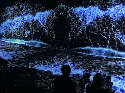
Just like not at home!

Creatures in transition

Transition was a smash hit in the theme pool of the exhibition. Cecilia Bengolea’s Favorite Positions, portraying a computer-generated feminine body as a transparent vessel of unknown liquid that drips from her contours, the transformation is mostly about positions. And octopuses. In Bestiaire, from the same artist, a similarly glossy body transforms into variety of fanciful creatures, retaining the theme of positions as well. 

One of the favourite positions

Another position, with more colours

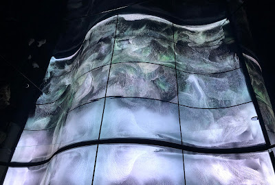
Transfiguration by Universal Everything is way more straightforward. A creature walks in a glossy-floored void to an unchanging beat and turns into different kind of materials from fire to goo to rocks to ice and everything between. The thumping soundtrack alters accordingly. “What a banal spectacle” was my first thought, but soon I realised I had been watching the thing for quite some time, mesmerised. A more poetic version of transforming, Morando by a’strict depicted images of blooming and fading peonies in transparent screens. You know, circle of life and stuff. Also, a lot of technical details. 

The goo phase. One of them.

See through peonies and screens


Textual nagging 

Technical details were abundant in most of the information posters and I wonder why do I need to know that stuff? The peonies are just as beautiful and engaging, no matter what’s the specific type of the screen used. The answer may lie in the list of sponsors, but I've noticed this phenomena in non-sponsored exhibitions, too. Well, at least this time no-one wanted to tell me the exact amount the led lights used in an artwork, which seems to be Very Important Information in a lot of light art festivals.

iart Studio's Flower Meadows is created using flexible OLED displays

The poster for Random International’s Algorithmic Swarm Study was rich with words like algorithm, processes and software, which led me to expect a little more than a group of 3d coins in the air. Mind you, I'm not yearning for a flashy spectacle here, but some sense of what is this and why is it, in the first place. Same applies to information text for Je Baak’s Universe, in a way. Lots of big expressions with  no connection to the artwork (that I could see). But maybe this more a question about texts than artworks, the former being quite neglected area in the new waves of contemporary art.

Swarm in action

Amusement park in a void


Other people writing about Lux

• Julian Stallabrass / New Left Review: Sublime Calculation

****
Spectacular thanks to Niilo Helander Foundation, that has made possible my Grand Tour of Light Art, including the visit to LUX.

Thursday, 11 November 2021

Drop the Light Art!

Projio in Tampere is an interesting media art festival, that would do just fine without the light art appendix.

I loved the compactness of the Projio festival 2021. Just one building and six artists! Well, the VJ competition made a bunch more, but still. It was so much easier to concentrate to the art works with no pressure of seeing five hundred more, or walk miles to get to those five hundred more artworks. I also appreciate the curating of the festival: most of the art works had something quite meditational in common, but they were in no way too similar with each other.

Having time for concentrating was especially important with Yu Hsuan Yao’s Séance, with its intensifying dramaturgic arch and visual finesse. Projected on multi-layer gauzes and screens, the piece depicts a Taoist ritual in 360°. It’s not documentary, though, but gives a somewhat trancelike, even part-taking feeling when watched long enough. At least it did for me.


Ghosts or people? Doesn't really matter in Séance
Photo: Katja Muttilainen

Folding abundance of Visual Meditation

Patterns dissolving in Dissolving Patterns

Teemu Raudaskoski also used gauze in his Visual Meditation, but more for softening the image than layering it, I reckon. The gauze also emphasized the abundance of visual material, consisting of recognizable forest imagery, shattered, distorted and then recomposed. The overwhelming amount of material could be observed as separate details, but I enjoyed the general composition, which made me think of fruit and flower stilllebens of the 18th century. Except, of course, that the leben here was not still at all.

I was impressed by the near-abstraction and genial site-specifity of Janne Ahola’s Levottomuus (Restlessness) in FLASH Vallisaari exhibition some years ago. Projio's Dissolving Patterns, projected on the façade, was more of a flying bricks and twisting towers kind of traditional projection mapping piece. I know, everyone and their cousin love this awe inspiring style, but I for one sure hope to see mr. Ahola’s further forays into realms of non-geometric subtlety. 

Suvi Parrilla’s Kemiallinen kirkastus was subtle all right, even to the point of non-visibility. I’d like to think that was intentional, since the theme of the piece is disappearing of fish, caused by chemical clarification in lake Mikkolanlammi. Non-striking doesn’t mean non-interesting, I should add. White contours of the fish, floating gracefully around the façade, with added colour splash every now and then, were visually and thematically very thought of. 

Barely visible fish in Parrilla's artwork

Soft glow and crispy lines in Teemu Määttänen's Fold

If I'd do anything as tidy as Määttänen ever, I would show it to the world, too
Photo: Katja Muttilainen

Antti Pussinen's glowing globe

White lines were in an even more important role in Teemu Määttänen’s Folded. According to the name, the canvas was made of meticulously folded pieces of cardboard, where the projected white lines flowed across the ridges. This beautiful study of light and form is a close relative to a previous artwork of mr. Määttänen, Atlas Tree, where similar lines stroked a trunk of a tree. Then again, I don’t recall that many artworks by Määttänen, where white lines did not play a part. Not that I’m complaining, white crispy lines are one of the things that make life worth living!

I have previously seen Antti Pussinen’n Nth wave in the Oksasenkatu 11 gallery in Helsinki, where it floated in its own solitude in the gallery, behind the window, quite ominously. Here the display was quite different, but the somber beauty was still there. 

I’m not too familiar with video jockey culture, but I do find the accompanying VJ competition, organized in cooperation with Tampere Film Festival, to be a great idea and an example of good synergy. The huge wall of the Vooninki building made a good canvas for the projected art works, with its light surface and distinctive details. The videos were not the projection mapping kind I expected (and feared), but more like short, somewhat dreamlike movies. Every artwork had the same music, which I understood was a starting point for the artists. I have to say, though, that I didn’t sense a super galactic mind-blowing connection between the videos and the music, and I even dare to wonder why this particular, quite ambient music was chosen.

VJ Vixen's Primitives was my favourite for simplicity,
60's style bold colours and considering the façade's details

Projio is advertised as media and light art festival, but the light part was all but nonexistent. Yes, there was some light stuff around Vooninki building, but the name of the artist was not easy to find. Actually, I can’t even say if I did. So, light art clearly wasn’t the focus here. Also, light art is part of media arts, so no need to mention it separately. Also too, nice area lighting doesn't have to be called light art. Also three, I think the video art was quite enough, and there are about gazillion light art festivals already anyway. I don’t say this often, but forget about light art, you’ll do just fine without!

I wouldn't call it art, but the lighting around Vooninki was nice.
Photo: Katja Muttilainen

Bonus Track

My guide this evening was Katja Muttilainen, who knows Tampere, light and especially light in Tampere well. Some of the photos of this posting are by her, since she has a less shitty camera and more talent than me. In addition to Projio, we visited a brand new tram stop light art work by Jaakko Himanen and checked the lighting of Tammerkoski rapids by WhiteNight Lighting. Both were super. We also had a hearty dinner at Tuulensuu gastro pub, where Katja explained my erratic behaviour to the waiter: "She's from Helsinki". You know, there's this friendly-ish competition between the cities of Tampere, Helsinki and Turku, and we like to mock each other when ever the opportunity arises. Mocking me for being from Helsinki was totally okay, of course, since it was a punch up.

The weather was inhumane, but wet ground sure served Jaakko Himanen's art work well


Friday, 20 September 2019

Blinded by the Light Art of Venice: Biennale area

Too much art is certainly a first world problem, but it does get real when you're in Venice during the Biennale. In order to survive the emotionally suffocating amount of art in the city, one can start with concentrating on one aspect of art. In my case, that was obviously light in art.

Remembering last editions of the Biennale, light played a lesser part in the works in the Giardini national pavilions. The main exhibition there lacked light in the number of art works, but the sheer amount of it, when used, was often pretty considerable. Even painfully so. In the Biennale's Arsenale site, however, light was widely used. In some cases it took the lead, but mostly it was used in supporting roles. There were also quite an amount of sporadic light and lightish art in the national pavilions spattered in the city, outside Giardini and Arsenale, of which I'll mention a few. The non-Biennale-related exhibitions had their fair share of light, too. A fair, fair share.

Giardini


In my posting about Prague Quadrennial scenography show I briefly brushed the theme of thin line between scenography and fine arts. I was happy to find a reason to smile smugly when I found this piece in the Russian pavilion. The artist was also on display in PQ, which totally proved my point. Alexander Shishkin-Hokusai's coulisse had some more mechanics involved this time, and some whimsical neon light, too. Blatantly old fashioned and wonderful!


I though I could stand any amount of light, with my vast experience with it, but no. I just had to close my eyes in front of the painfully full radiance and walk half blind through Ryoji Ikeda's spectra III in the main exhibition. First it got me really irritated and wondering why is this done in the first place and is it even art and my imaginary child could have done this and after a few hours of pondering I realised I had been thinking quite the essential questions of art. Well done, Mr. Ikeda, but I still hate you!


Venice's own pavilion has lately been quite the Liberace of the Biennale, putting forward everything shiny and expensive la Serenissima has to offer. Luckily, this year it had a more distinguished and subtle approach to the essence of the city. I especially enjoyed the immersive artwork by Plastique Fantastique and Fabio Viale, which grasped both the romantic and melancholic atmosphere of the drowning city, quite haptically, without unnecessary embellishments.

Arsenale


Here's an example of not often seen political light art. Tavares Strachan's Robert Henry Lawrence Jr here and an earlier but similar What Will Be Remembered in the Face of All that Is Forgotten are more or less straightforward comments on remarkable persons, faded in history, most likely because of their gender and colour. 


It was nice to watch the breathing hues of these "corals" and I do appreciate military materials used for art rather than war, but somehow the piece by Christine and Margaret Wertheim was a little too showcase-y for my taste. However beautiful the electroluminescent wire was, it still was just electroluminescent wire. With nice colours. The context, however, brings some content to it: the other pieces of Crochet Coral Reef are handicrafted corals, commenting the great barrier reef and the possible loss of it. This one was taken aside for the darkness it needs, I presume.


Korakrit Arunanondchai's No history in a room filled with people with funny names 5 was another example of the thin line between using video as media or as light. Sometimes the information of image was the main point of attention, sometimes the screens were filled with pure abstract colour fields, making them luminous sources of light. This, of course, defines if the art work falls to category of video art or light art. Which is a question no one but an obdurate classifier, such as myself, should be bothered with. 


Hito Steyerl's piece This is the Future included some accidental light art in the form of most wonderful reflections. And yes, I'm a fangirl looking for any excuse to include Steyerl's work here, even though it's pretty obviously not light art per se.


Here's one example of increasing use of light as material for an artwork. Alex da Corte's Rubber Pen Devil is a hilarious series of videos of Satan and his pals, shown in a neon framed auditorium. The light in itself was definitely not the main attraction of the piece, but it did bring a certain kind of modernist-decadent mood to the space and thus to the experience of the videos. This was not just well designed, unobtrusive lighting, but very precise part of the artistic whole.


Most of the attention in the Indonesian pavilion was stolen by the big ferris wheel in the middle, but pretty soon my interest was stolen away by the light numbers on the ceiling. I couldn't quite catch the idea of them, nor did I find information about the piece. Which probably was there right in front of my eyes. Anyhow, the lights of Lost Verses by Handiwirman Saputra and Syagini Ratna Wulan really got me thinking, wondering even.


Not in any way technically amazing or visually staggering, Synchronocity by Apichatpong Weerasethakul and Hisakado Tsuyoshi wasn't too easy to get, lightwise. I still don't know if I did, since after wondering, what's the light gimmick here, what with the fading bulbs and random general lighting, I realised there isn't one. By then I was far too mesmerised by the piece for not liking it so, yeah, I could say it really caught me. 


Even though Saules Suns by Daiga Grantiņa in the Latvian pavilion didn't include light wow effects either, the quasi sloppy untidiness felt a bit arrogant to me – even though there was something interesting in the use of light, when I really put my mind to it. I'm all for messiness, that's not the problem, but I quite felt like someone is inventing the wheel again and making it crappy on purpose.


I do love me some good neon allright, but this particular work by Gabriel Rico, I think, was in a wrong environment in the hallways of Arsenale. The placement made the work seem diminished, something taken to the corner, out of way. The surreal in the art work was nullified into awkward by mere misplacement. That's a bummer, since mr. Rico seems very interesting artist, especially by his use of light.


Hypersonic Hyperstitions by Marko Pelhjan of the Slovenian pavilion was probably one of the most photographed pieces in Arsenale. It was also one the pieces whose message was lost on me. Later Google told me all kind of interesting ideas about hypersonic weapons and stuff, but at the site all I could think of was a vehicle commercial from Galactica. Or this: 


There seems to be a certain trend in the use of light in contemporary art, which could be called souvenirism. The light emitting materials used in this kind of art include, indeed, actual blinking souvenirs, but also motley selection of other shiny bric-a-brac. 


Here's just two examples of many: Lee Bul's Aubade and Tracey Snelling's Shanghai/Chongqing Hot Pot/Mixtape. See also Thailand's pavilion, later. Snelling "gathers information through the process of wandering, observing, participating and documenting", which is pretty much what tourists do, and thus matches my self-invented -ism perfectly.


After the long walk of multi layer of meta levels art pieces in the Arsenale's never ending corridor, it was a relief to see some sunlight. Call me easy, but I enjoyed tremendously A Place without Whence or Whither by Chen Qi, an outdoors extension of Chinese pavilion. The idea was simple, pretty much from a course of lighting design for beginners: holes in surface where the light gets through and makes nice patterns on the other surface. That's what we do in theatre all the time. The work really was border line kitschy, but it didn't try to disguise in any kind of deeper philosophy, which I do appreciate. It was what it was. Just lovely!

See also:
Blinded by the Light Art of Venice: Other National Pavilions
Blinded by the Light Art of Venice: Other Exhibitions

Blinded by the Light Art of Venice: Other National Pavilions

These days, a lot of interesting Venice Biennale stuff is to be found outside the official exhibition. Here are some interesting examples, light wise.


Thailand's pavilion is situated right in front of Giardini, in a restaurant. Or, more precisely, in a room between the dining area and the kitchen. It's a blatant collection of souvenir kitsch, lit with equally kitsch ever changing LED lighting. Restaurant patrons looking for a toilet and staff looking for patrons who are looking for toilet give the exhibition experience an extra layer of dead pan comical je ne sais quoi, which couldn't possibly be created on purpose. Highly recommended experience!


I have a soft spot for Azerbaijan after teaching some very talented and wonderful art students there, and I admit that otherwise I wouldn't probably have visited Azerbaijani pavilion in the first place. I'm glad I did, since there was some fractal style light meditation to be found there, in the shape of giant ever changing ring Globe by Kanan Aliyev and Ulviyya Aliyeva. I'm not surprised that the name of Aliyev was ever-present, since nothing in Azerbaijan seems to happen without an Aliyev, the president Ilman, his relative, or at least Heydar Aliyev foundation, founded to celebrate the memory of previous president, the father of the present one.


I wonder when I'll learn to schedule my art staring trips so that I'm not totally overwhelmed by the share mass of art seen. Probably next year. Always the next year. Anyhow, in between all the full packed exhibitions, Montenegro's quite minimalistic pavilion, An Odyssey by Vesko Gagović, was a much welcomed piece of mental reboot for me. The few large boxes with light glowing from beneath disturbed my sense of gravity in a most pleasurable way. As I lingered between them, other visitors came in, and I could read their minds: "Oh, boxes" as they exited right away. What's wrong with people these days! They were AWESOME boxes!

See also:
Blinded by the Light Art of Venice: Biennale area
Blinded by the Light Art of Venice: Other Exhibitions

Blinded by the Light Art of Venice: Other Exhibitions

Besides the official Venice Biennale pavilions, there are loads of other high and low rank exhibitions to see as well. It's nice to see the old and middle aged masters, but it's even more fun to stumble upon exhibitions of talented young artists, unable to advertise with larger than life ads along the canal. The latter did not include that much of light art this year, so not many mentions here, but take my word!


Dysfunctional in Ca d'Oro was a quite interesting hybrid of art and design. Light was present in many forms, mostly as lanterns and reflections. The interactive mirrors of Audience by Random International followed the visitor, who all of a sudden found herself to be pretty much in the center of everything. In addition to that, most beautiful reflections when Sun is shining. The oil-like colourful reflections of the venetian windows on the surface of the glass bubbles, called Moments of Happiness, by Verhoeven twins, are just perfect excuse to post photos of the said, quite cliché, windows. Because it's art, you know.


Visiting palazzo Fortuny is one of my musts in Venice. Not only for the usually interesting exhibitions there, but also for Mario Fortuny. When discussing mr. Fortuny with two friends of mine, I first mentioned that he was a big shot in the history of lighting design, then a couture interested friend added that he also invented bias-cut and the third friend asked if he was the same guy who designed the pattern of their couch pillows. Well, yes he was. Quite a multi talent man.

One of the most famous of his inventions (at least among the three people in the world interested in the history of lighting design) is the dome theatre with almost a realistic sky, pictured above. Also, the downstairs gate to canal usually is involved with some kind of lightish art. Now on display there was Fuori Tempo, a simple colour field work with gels by Francesco Candeloro.


Reagents in Complesso Ospedaletto displays some neon art by Arthur Duff. There's always room for one more work with neon letters, but the staircase of Ospedaletto really makes the visit worth while.


According to my social media flow, Yannis Kounellis seemed to be one of the hits of this year. I have to say I quite liked the exhibition, but more from an art history perspective than my own personal liking. The insta friendly golden wall was quite impressive, but the flame series was more of interest for me. First I though the propane tanks were purely conceptual, but then the guards announced that they were to be set ablaze in a moment and I felt so privileged to see that. Such a joy to see thematic, not just decorative use of light.


The Personal Structures series of exhibitions in palazzos Bembo and Mora and outside in Giardini della Marinaressa was probably my favourite. Loads of different techniques and styles, even more rooms to endlessly follow each other and some works interesting also light wise. For example Footprints, the light tube work by Wild Flag Studios animates the tubes according to current immigration data. Already the second example of political light art here. 

I think Daniel Pesta's Top Secret Chain also quite falls into this category, with its shady bunch of important men alighting their hands and stomping the fire out in turns, quite ritually. Kouji Ohno's Quantum Fluctuation was pretty interesting, but then I read the info plate and the work was spoiled by way, way too much and too detailed information. You just don't start with science lecture, add all kinds of philosophies, throw in some human existence and end up by describing what can be plainly seen. You just don't.


In Punta della dogana's Luogo e Segni exhibition, light was present in more conceptual forms. The dead-yellow greenhouse lights of Mesk-ellil by Hicham Berrada emphasised the artificial effect of light rather than its beauty while Roni Horn's huge, visually intriguing glass objects of Well and Truly changed elementally according to the position of Sun. Yes, I waited quite long a time to be sure. Then there was the chandelier We Are In Yucatan And Every Unpredicted Thing by Cerith Wyn Evans, a big name in light art. I enjoy a low hanging, abundant, Murano-style chandelier as much as the next guy, but the artistic idea of this piece escaped me. Maybe it's because I've seen approximately gazillion flickering bulbs before, with or without a chandelier. 

See also:
Blinded by the Light Art of Venice: Biennale area
Blinded by the Light Art of Venice: Other National Pavilions

Related Posts Plugin for WordPress, Blogger...