Thursday 17 November 2022

Don’t worry, it’s just art

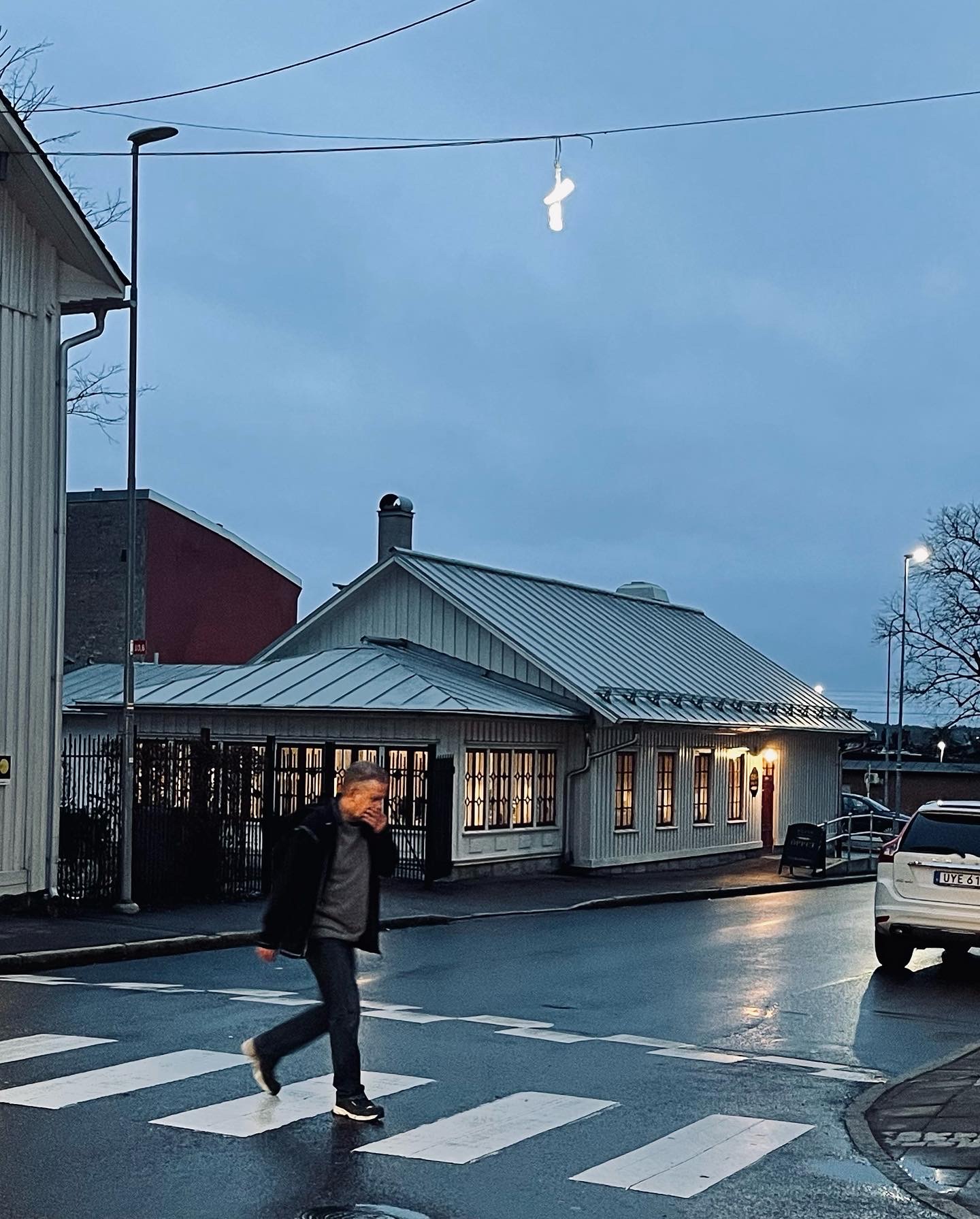
There are not too many light art festivals that I have an urge to visit again, but Arvika Ljus! is definitely one of them. Let me tell you why.

Ainu Palmu's Dove, Hope is about light, shadow and change

Arvika Ljus! is art, not spectacle. I’m not “magically amazed” as seems to be the objective of many light art festivals. Rather, I’m surprised, challenged, and fascinated. The artworks are carefully curated and every one of them has a reason to be there. Even if they don’t share an exact theme, material or style, the whole is coherent, and the spirit of the artworks support each other. 

The artworks are fluently site sensitive. Not all of them are planned to the places they are exhibited in, but all the sites have been carefully and intentionally chosen, giving the artworks a relation to the space. The festival is human size and cozy. But not too hygge, also some darker sides of life are dealt with.

Next time I visit, I have reason to believe I’ll be seeing something new. I don’t mean that every art piece will be not-seen-before, but they will not be a roster of flashy artworks that could be part of any festival, either. I’m sure I’ll recognise the same solid base of artistic endeavor, but the angle will be different. It will be a light art exhibition I don’t see anywhere else.

Lin de Mol's Individual Anarchy deals with often misinterpreted
urban phenomena of thrown away sneakers  
© Lin de Mol


This year, there are nine artworks, which I think is a perfect number to concentrate on each and still be able to see them in one night. I do recommend staying in Arvika a little longer, though, it is a town well worth a visit in its own right. It has an ample variety of odd spaces to fill with light art, and seeing the artworks is also a good way of seeing the town. You may want to start your tour in Elins Bakgård café. Just saying.

An urban campfire

All of a sudden I had an urge to organize a miniatyre light art festival.
Wonder why.

This place is so wrong and thus so absolutely right for this artwork


The (physically) largest artwork in the festival must be Fluxit by Vendel & de Wolf. It is a flickering campfire, balancing between nostalgic memories of a scout life past and a vision of future, where even the forest fires will not be real. The smallest artwork is just the size of a matchbox, quite literally. It also combines nostalgia and artificiality, though more consciously. Artificial Truth by Merijn Bolink is a diptych of two differently sized matchboxes, whose labels we all recognize from our memories. Or so we think. They are actually drawn by AI, heavily influenced by old matchbox labels. When looked up close, the images on them are quite Dadaistic and just barely figurative.

This is not, I repeat not Christine


I’ve seen Anne Roininen’s Car Show four times in four different locations, and it just doesn’t get old. It always expresses a new kind of commentary to the place it finds itself. The obviously haphazardly parked cars, filled with smoke and colours, have a distinct personality themselves, but they also make me wonder what kind of being has left them where they are.

This innocent-looking artwork became a kind of a scandal. The city management was called several times with reports of a dangerous, possibly exploding car. So much so, that a this-is-just-art-it-will-not-explode-I-promise kind of a sign had to be attached to the piece. I could snicker, but I rather find it quite endearing that Arvika folks look after their town.

A good point from Felice Hapetzeder


The festival is curated by Lin de Mol, also a wonderful artist and a demonstrated super woman. Another reason to come back is that I really want to see what will be the third part of de Mol’s light art triptych after glowing suitcases and shoes, but she wouldn’t tell. 

I'm betting... Falukorv?

***

My trip to Arvika has been supported by Frame Finland, and I thank them with all my heart.

Wednesday 12 October 2022

No Complaints about the Elephant´s Ass

Essen Light Festival 2022 leans on projections and led-lights’ limitless colour scheme.

Essen Light Festival is what I’d call a high street festival. Obviously, the route follows the main shopping street, and there is something for everyone. The pro of this style is that the route is easy to follow by just checking the map once and following others. The con is that the route is quite light-polluted and busy and gives no peace to immerse in the artworks. Usually there is no artistic coherency, either. But there might be a late night shopping event to compensate that.

There was no certain theme in Essen, either. The artworks were mainly varying style of projections, easy on the eye, and light-artworks based on or decorated with bright and/or ever changing colours. One thing that was paid attention to, was the use of electricity in the circumstances of today. This is a discussion that’s unavoidable concerning light festivals. I’m biased, of course, but it seems to me that most of the time the cancelling of festivals is a panic reaction for publicity reasons, which helps just a little or nothing at all. As was said in the Essen Light Festival brochure: "You use more electricity if you stay home". Well put. 


The halos were planned for people of various heights. Appreciated!

Angels of Freedom by Merav Eitan and Gaston Zahr is an artwork I’ve been using as an example of simple and practical interactivity in my light art lectures. It was pretty nice to see it live, and in frequent use – everybody seems to want a halo! Also, it’s one of the insta-friendliest artworks I’ve seen. Even I was tempted, I admit, despite the fact that I hate insta-friendliness.

The face in its simple phase

Quite often I wonder why projection mapping artworks art stuffed with everything and its cousin, instead of studying one idea at a time. Or, at least, less than ten. The same goes with Radu Ignat’s Facelessmen. The work includes pretty interesting concept and ideas – I especially enjoyed the play with different faces – but also some technical show-off that diminished its distinctiveness. 

The first elephant in the festival

Stephane Masson, on the other hand, did concentrate on one thing, that being unexpected things in a cage in his I Caught a... I love the idea and the simple everyday magic in its realisation, even though I doubt the necessity of the blinking light strips of the cage. Then again, the artwork was in a busy corner, maybe it needed some bling to compete with the environment.

The second elephant in the festival

Bibi is probably the most adorable light artist I’ve seen (via Zoom, but still), and so are his artworks, usually huge and colorful lego-like animals, made of recycled plastic cans. Like Eléphant Rouge. Especially when seen live. His works are so simple and untroubled that I just can’t but like them. Usually, I wouldn’t be too happy about the view from my hotel room being an elephant’s ass, but in this case, I didn’t complain.

My Room with the View

Children's drawings are a big hit in this season.
Here's the Essen version, Imagine by Daniel and Carina Kurniczak. 


Monday 3 October 2022

Loud and Quiet in Łódź

The major attraction of Light.Move.Festival 2022 is a series of projection mappings, but some light art works are on display, as well as music and other projects. So there's a lot to see and hear. A bit too much, maybe.

The question of the quality of art is a subjective one, don’t let any art critic claim otherwise. It’s always about personal taste. So, if I didn’t quite get the Light.Move.Festival, it’s not because it was bad, it just wasn’t up to my alley. 

How come? 

Mainly, the festival was too loud to my taste. The music was loud, the colours were loud and the flashing trinkets on sale everywhere and worn by everyone were especially loud. Maybe I’m just too Finnish or middle-aged (Fiddle-aged?), but it was all too much for me. 


I also have a problem with projection mapping pieces and their homogeneity, and the sugar coated mappings in Łódź gave no reason to change my mind. The projections were so similar, that I was surprised they were made by different artists. Pretty much all of them were painting façades with candy colours, adding whirling or wobbling cute animals and/or flowers, and some sparks to finish. With very interchangeable music. And one Porche commercial. Not my alley.


Students to the Rescue

As a silver lining, there was a bunch of wonderful artworks by students from Academy of Fine Arts in Łódź, Academy of Fine Arts in Warsaw and Institute of Media Art, scattered around the festival. Some of them were in demo stage, but they had sincerity and artistic endeavour, which I do appreciate. The most subtle ones were often overwhelmed by the surrounding loudness of the festival, though, which could have been avoided with more careful placing of the artworks. 

Kamil Druks' artwork beat the surrounding loudness by being deliberately quiet. At first, I thought the flickering of parks's light posts was just a failure in the lighting system, but the design of the flicker told me this was no accident. Which the exhibition label confirmed. It also told me that the flickering was lights morseing “Consciousness”. Not only was the artwork beautifully designed, studying one very simple idea in depth, but it also drew a fine line between art and accident. If I was to decide, this fine piece of conceptual light art would be installed in the park permanently.

A still photo really doesn't tell much about Mr. Druk's artwork. See it in Youtube. 

The delicate Przebudzenie by Zuzanna Białecka was projected on a bed

Misty Reflection by Julia Podborączyńska and Joanna Bury
gave a chance to get lost in light for a while

Divinum Lumen was a student exhibition indoors.
This artwork is by either Włodzimierz Szymański, Klaudia Długołęcka or Andrzej Zwierzchowski,
from the Institute of Media Art. Please let me know, if you know the exact artist,
the exhibition info wouldn't tell.

Looking at You Looking at Me by Piotr Lewandowski and Karo Zacharski
was an ogling comment on constant visibility


Sparkling Joy, After All

Even if I didn’t find the festival that enjoyable, pretty much everyone else seemed to like it. And that’s what the big light festivals mostly are for. There were many happy, wide smiles to be seen, especially on the faces of the youngest audience segment. In particular under the many large mirror balls – and those sparks are something I get as well. You can't go wrong with a mirror ball!


Touristy Tip: Buying Train Tickets

The ticket reservation system of Polish Railways is archaic, to put it nicely. You may order tickets online, yes, but they are sent to you as paper tickets by mail and must be ordered centuries beforehand. So, I decided to buy my (mandatory) seat reservations to go with my Interrail ticket from the station in Lodz. According to my one experience: always find a clerk with whom you have a common language. My first two attempts ended up to the clerk waving their hands and talking Polish to me. Loud, since I didn’t understand. Even louder since I didn’t understand the loud version. Google translator had a bug in it, I guess, since judging on the clerk’s reaction, it translated my very polite "May I reserve a seat for this train on this day please" to "F*ck off you f*cking f*ck". Without the please, I believe. The third clerk spoke some English and everything went fine and dandy. With stamps and all.


Sunday 25 September 2022

Panta Rhei Meanders Through Space

It is quite logical that a waterworks/energy company, having its anniversary, would arrange an art exhibition, concentrating on light as a material and water and time as themes. And that's what RheinEnergie did. The result is exhibition Panta rhei (29.4.–25.9.2022), where time, water and light intermingle effortlessly in the beautiful old waterworks building. 

Molitor & Kuzmin underground

There were two projection artworks, quite different visually, both dealing with rippling water. In François Schwamborn’s Nervous Water we see a water surface, reflecting greenery around it, in a very slow motion. It’s hard to tell if the material is filmed, painted of computer generated, since the slowness of it sheds the characteristics of rippling water and renders the material beautifully impressionist. 

Claude Monet would have loved this


Hartung & Trenz had a another piece called Panta rhei in Brixen Light Art Festival last spring, so they're familiar with the theme. Will get back to that festival later. The artist duo use projected texts regularly in their work, and Momentum is no exception. The words “kinetai kai pei ta panta” (another version of "everything moves") are projected to the wall, building up a meandering river of words. I did catch some other words as well, like “lager”, but that might have been just a premonition, see "Touristy Tips" at the end. The ripple here was caused by reflecting water pools and dropping water, but also by the viewers walking past the projectors. Interactivity!

Words rippling

Bastian Hoffmann’s two minimalistic water sculptures (both called Untitled) were the most concrete handling of water in the exhibition. A stable water jet, seemingly defying gravity and disturbance, disappeared in a hole, forming a glass-like arch. The simplicity and serenity of the artworks made a great impression to me. There really wasn’t anything to show off, just the idea. For once, I didn’t touch the artwork. But I really, really wanted to. 

Eero Saarinen would have loved this

Mischa Kuball, on the other hand, dealt with water in a more figurative way, quite unlike his other works I've seen. In Objects, artefacts and other damages abandoned historical and contemporary objects float in a long, video-projected river, while it turns all murky. The murkiness starts from a coffee box, which I, as an avid coffee drinker, take a little offense of. 

Yes, blame the coffee drinkers

Mirrors and infinity rooms are a big trend in light art at the moment. Huge trend. Remembering LUX: New Wave of Contemporary Art with its several reflections-based ideas I wondered if there’s still something new to it. Surprisingly, Jacqueline Hen’s super simple infinity grid Light High went back to basics, and it was quite refreshing in my simple mind. Even the slight ripple in lights in the start and end of the loop felt a tad unnecessary show-off.

Know your coordinates

Molitor & Kuzmin had a take on time and moving. Fluorescents en masse tend to be impressive and that’s what Molitor & Kuzmin went with. Which is no surprise, they are masters of fluorescent heaps after all. The obviously site-specific Scratch fills a pit and the space above it with rigorously organized fluorescents, and on the bottom of the artwork there are discs spinning, with “time” or “zeit” written on them with neon. Yes, everything moves, and time especially so.

Time is spinning

The route was carefully planned, meandering through the building in an unexpected but comprehensive order, revealing a nook (and artwork) after another. The artworks are in unity with the space, rather than objects scattered into an exhibition hall. I’m really glad that the space is not stuffed with artworks, the ones there are, are quite enough. The exhibition is coherent thematically, but diverse in form. I hope there will be other light based exhibitions in the space, it is really apt to it!

Touristy Tip

It's hard to imagine that a Finnish power company would have a bar of their own, but that seems to be no problem in Germany: there’s a really nice beer garden in the back yard. 


Monday 19 September 2022

Breathing the space

The Light & Space exhibition in Copenhagen Contemporary (3.12.21 – 4.9.22) was an ambitious and comprehensive overview on the style, providing maybe a little bit more than needed.

A part of Helen Pashgian's Untitled (2006–2007)

Copenhagen Contemporary is a gallery – or, rather, an exhibition space – specialized on installation art. With its several large halls it is apt for the job, and certainly a venue to pay attention to, especially light-art-wise. 

The gallery provides a wide range exhibition of Light & Space movement– or “movement”, since it wasn’t a coherent consortium, but a bunch of people doing roughly same kind of stuff, more or less aware of each other. The style was born in California in the 60’s, concentrating on, you guessed it, light and space. In addition to Californian sunlight, the local airplane and car industry contributed, too, with easily available new materials and technologies, and an interest in cooperation with artists. Thus the sleek, finished, technological look.

In the Light and Space movement, perception is the key, and light and space are the obvious tools to manipulate that. Installations are the usual format of Light and Space, for, you know, including light and space, but other genres of art are included as well. Artworks often count on the viewer: the artwork is not merely observed but experienced. And sometimes that is not just a fancy word. 

Some of the artworks in the exhibition deal with both light and space, some with either, some with neither, at least not more than artworks usually do. I’ll concentrate on the works checking both boxes. A crueler approach to choosing the artworks might have done the exhibition a tad more distinctive, instead of trying to give an example of everything. Anyhow, it was very well worth seeing as it was.

More of Robert Irwin's Light and Space below


Tricks and Treats

The strongest example of experiencing in the exhibition is Eric Orr’s Zero Mass, originally from 1969, a highly conceptual light art piece, with a minimal use of light. And I do mean minimal. The audience is lead to a totally dark, paper-walled room and supposed just to be there. And wait. Which I did. And realised I started to see in the dark. Well, almost. I think I caught a very weak light glowing behind the paper wall. The feeling of seeing absolutely nothing, only daring to move in super slow motion and then gradually getting a grasp of space and being able to move freely, is a tremendous one. It’s a bit like being able to breath the space, all of a sudden. I’m proud of myself for not whispering “Yeeeeesssss” in a husky demon voice to the ears of newcomers, wondering aloud if there are other people in the space. 

No photo, for obvious reasons.

There is no Light & Space exhibition without James Turrell. Here, the artwork is a walk-in installation Aftershock 2021 in his Ganzfeld series. If Orr’s piece made my brains create light, Turrell’s made it create smoke where there was none. And enjoy the colours. I am somewhat prejudiced towards artworks, where changing of colours is the main idea, always fearing the horror of a witless rainbow effect. In Turrell’s works, no fear of such. Random or not, the changes and colour combinations are surprising, deliberate and oh, so beautiful.

Persons standing in a traditional installation art poses in Turrell's piece.
James Turrell, Aftershock (2021) Courtesy the artist and Häusler Contemporary Zurich.
Light & Space at Copenhagen Contemporary, 2021. Photo: Florian Holzherr


Doug Wheeler’s LC 71 NY DZ 13 DW tricks the mind in yet another way. Even if I didn’t quite feel that my perception of time and space was challenged, as the exhibition text suggested, I did feel an elevating airiness and openness of space, which is quite surprising in a very closed, if white, dome. Mentally, I lost at least twenty pounds, the infinite white and convex floor fooling my sense of gravity.

A person standing in a traditional installation art pose in Wheeler's piece.
Doug Wheeler, LC 71 NY DZ 13 DW, 2013
Reinforced fiberglass, flat white titanium dioxide latex, LED light,
and DMX control 556,3 x 1958,3 x 2060,9 cm
© Doug Wheeler Courtesy David Zwirner
Light & Space, Copenhagen Contemporary, 2021.
Photo: David Stjernholm


Art for Gods, Possibly Not on Purpose

It takes me some time to figure if the hovering daisy-colored spot in the middle of Helen Pashgian’s Untitled (2021) is light or matter. Of course, it makes no difference. Even if the word “temple” was mentioned in the text defining the Turrell piece, this artwork reminded me most of a one. The room was the closest I can imagine a modern-day worshipper of Egyptian Sun god Ra could ask for.

Welcome to the temple of Hipster-Ra

Mary Corse’s light canvases seem like potential religious art in my mind as well. Almost all of the religions pay a great deal of attention to light, inner or outer, and it makes me wonder why light isn’t used more often as material in, for example, altar pieces? I mean, light would tell way more about spirituality than a dead body. But what do I know, I’m an agnostic. Anyhow, the glowing Untitled (2019) is a great source of inner peace, even if it was placed in quite a busy corner.

Mary Corse, Untitled (Electric Light) (2019)
© Mary Corse Courtesy the artist and Kayne Griffin, Los Angeles
Light & Space, Copenhagen Contemporary, 2021.
Photo: David Stjernholm


Light, Space, Art and Some Unforgivable Awesomeness

Robert Irwin’s Light and Space (2007) is another edition of his recurrent Light and Space series, rethought for every exhibition space. It is quite impressive here, yes, but I was spoiled in Light Art Space’s version of 2021 in Kraftwerk Berlin. It was absolutely great, so perfect in that space, that any other edition just doesn't do it for me anymore. It really was space as art, not art in a space. Even if I try to tell myself that they are all different artworks, I just cannot forget that awesomeness. 

Sorry, Robert.

Light and Space in Light & Space, where it was light in space

Light and Space in Light Art Space, where it was space as art


So Far Unfinished Web

The artworks in the exhibition are advertised with words like magnificent and gigantic, which is not the whole picture, to say the least. Yes, some of the artworks are big indeed, but there are quite a few ordinary sized artworks as well. Words like that lay out expectations that I’m not sure the subtle, stylish, and delicate artworks of the exhibition fulfil. Nor do I think they should.

There were a lot of sections in the exhibition, like Nature as Material or Architecture and Art. All of these were great themes, even if some were not that essential to Light and Space movement. The exhibition was also a good summary of who’s who in Light and Space, but even there were a few hangarounds – although interesting artists in their own right. The wide scape of themes left some of the artworks quite unconnected to each other, or even to the main theme of the exhibition. 

In my dream world, this would be a crash course to Light and Space, followed by a whole series going deeper in the themes introduced here. 

I would go! 

The perfectly rough façade of the CC


Other People Writing about Light & Space

• 
Nanna Friis / Kunstkritikk: Quantity Consciousness 
• Jeni Porter / Wallpaper: ‘Light & Space’ at Copenhagen Contemporary: ‘moving art without moving elements’ 
• Veena / Mycafe101 Light & space – Copenhagen Contemporary

Saturday 25 June 2022

F-light: Hooray for History

A friend of mine once said that Florence is so full of old art that it really isn’t motivated to find contemporary approaches. Judging by the F-light festival 2021, that is true. Most of the material seen was based on old masterpieces and/or shown in historically important venues. And why not – masterpieces are called masterpieces for a reason! 

The festival includes light art, video art, architectural lighting and something I would call Christmas lights. The pieces were spattered around the city, giving a chance to see other places than just the Duomo. Which is – I can't stress this enough – worth seeing. The outer skirts venues were mostly about architectural lighting, the flashiest projections were in the immediate centrum. After six weeks of travelling and feet tired like a prayer of a person fallen asleep (another Finnish expression for you to enjoy), I decided to concentrate on the central area.

The very loose theme for the edition was reflections. I quite didn't catch it while watching the artworks, not in a concrete way anyhow. Except for reflecting the old masterpieces. The theme was mentioned in some of  the info texts, but defined so widely it basically included everything. Also, Narcissus was referred to. 

Judith reflecting future with Holofernes by Artemisia Gentileschi.
Go see the painting in the Uffizi, it's supreme!


There was history in many layers in the projection based on La Divina Commedia on the façades of Museo Galileo and Camera di Commercio (artist unknown). I couldn't quite follow the plot, since I, unlike Italians, don't know Dante's texts by heart. So, I took it as an enjoyable piece of dada art, where anyone or anything could float to the wall next. Reflections by The Fake Factory, projected to the trademark Ponte Vecchio bridge, was more twofold. The art treasures of renaissance took turns with more modern, colourful and abstract images. I'm not quite sure of the latter, though. Maybe one theme is enough for one artwork and in this case, I'd go with history. 

Ponte Vecchio was one of the spots where sponsors' messages and information clips gained a tad too much time for my taste, in addition to being quite unbecoming. I know Italy's range in culture is wide to say the least, but the incessant tacky spacers were more Ragazze Cin Cin than Artemisia Gentileschi. Art is always a question of taste, but I do prefer the latter.

A Dada Commedia
Ponte Vecchio coated with history
Ponte Vecchio coated with colours


Even if history played a great part, the modern days were not totally forgotten. In the Reflexus series of short video artworks by the 2nd year students of ISIA Florence, the historical imagery was mixed with flashes of nowaday people – and some nowaday fauna, in a simple, stylish way. The Stream of Consciousness by METAEXPERIENCE. ART combined Piazza della Santissima Annunciata, one of Medici statues and projected texts, that are all the rage in the modern video art. As are "artificial intelligence and the most complex algorithms", which were used also here, not that it made any difference. Unfortunately, the projectors were a tad weak for the existing light and the texts did not appear as powerful as they could have. 

A person of history
Persons of today
Looking carefully, you'll see the writings on the floor

Florence is a fairy castle before Christmas, with streets adorned with abundant but stylish Christmas lights. Well, as stylish as Christmas lights go. In addition, F-light did its part in decorations, if only in off-program. The Mercato piece by Faniuolo reminds me of some other light works I've seen during my trip, like Valerio Festi's Porte Celesti in GLOW Eindhoven and Famiglia De Cagna's La Cat­te­dra­le di Luce in Ghent. Sometimes these mosaic-like light installations are classified as decorations, sometimes as art. An interestingly fluid demarcation.

Also in off-program there was the Christmas explosion on the façade of La Rinascente department store. A net of lights ran through different kinds of colour schemes, interrupted by a tad artsier animations. Anyhow, this one is easily classified as a decoration, if a splendid one.

Mercato Christmas lights are a tradition
A subtle moment in the Rinascente Christmas lighting


As to the actual light art part, there wasn't too much of it.  As it happens, this was also the most high art stuff in the festival. The most obvious example, Siamo con voi nella notte (We are with you in the night) by artistic collective Claire Fontaine at Museo Novecento has its roots in neon letter art, big in the 60's, having a comeback, it seems. Led lights have replaced neon, though, as they have here. Could have fooled me, led lights are pretty damn good these days. Anyhow, light letter art is often laconic and / or political, and same goes here, starting with the name. Siamo con voi nella notte is a graffiti slogan from 70's, expressing solidarity with political prisoners. The artwork is a comment on closure of museums because of the epidemic, a kind reminder that art is still there, and is provided to the public by all means possible. Like making a square a piece of art by claiming it with a sign.

Subtle art takes over the whole piazza


Even though I’m really into contemporary art, I found the old-fashioned approach quite refreshing and something I haven’t witnessed in any other flight art estival. Maybe Florence isn’t a beacon of contemporary light art but why should it be? In a city like this, full of historical beauty, why not flaunt it proudly – and maybe take a little more daring take, artistically? 

And while at it, think of a more stylish way to advertise the sponsors.

Other people writing about F-light

Ciao tutti: Firenze Light Festival – prachtige lichtshow op de mooiste monumenten van Florence (in Dutch)
Emergenza Cultura: L’anima e l’arte di Firenze svendute a sponsor e loghi (in Italian)

Touristy tip

If you're travelling by train to/from Bologna and want to enjoy the scenery while travelling, a warning: two thirds on the route from Florence is tunnels. Florence-Rome stretch is quite tunnel-y as well, but not nearly as bad. 


****
Spectacular thanks to Niilo Helander Foundation, that has made possible my Grand Tour of Light Art, including the visit to F-light.
Related Posts Plugin for WordPress, Blogger...