Showing posts with label Light Art Festival. Show all posts

Friday, 12 June 2026

Probably the smallest light art festival in the world

Light festivals often aim to be big, flashy and as extravaganza as possible. Thesmallest festival certainly doesn’t. Its idea is to have very small light art works in just a few blocks’ area, placed in existing spots, without any extra structures. After the first edition, Thesmallest Vallila, here’s some looking-back from the curator’s viewpoint. 

There were some flashing colours even in Thesmallest Vallila.
Pasi Rauhala: Disco Pope. Photo: Hannu Iso-Oja.

Even our leaflets were tiny. A huge amount of folding, though.

Where it all started

After seeing Merijn Bolink's Artificial Truth in Arvika ljus! festival in 2022, the idea of a miniature light art festival had been on my to-do list. I didn’t actually do anything about it, though, before I met my colleague and now friend Stefan Aleksandar Jovanovski. After an hour or so after we first met, we decided to do the festival together. And so we did, as the instantly founded, Finnish-Macedonian Thesmallest Collective. The first edition, Thesmallest Vallila, was in my hoods, in the wooden house area Puu-Vallila, in Helsinki, in October 2025. 

I’m a keen traveler, and I do admit that in addition to artistic aims, I also thought Thesmallest would be an easy, light and cheap-to-product festival, that fits into one bag and would be our ticket to nice festivals in fancy places around the world. 

Well, let’s see how that went.


This is where it all started in Arvika.
Merijn Bolink: Artificial Truth.

Windows, the easy way out

The idea was to place the artworks mainly in windows, to be easily seen but still safely indoors. This way we could avoid building extra infrastructure and paying for security, instead engaging the community in the event. The people of Puu-Vallila were very window-generous, as I enquired about the matter in the local social media, which obviously made me happy. As did all the help we got from the people and businesses of the area. I just cannot thank them all enough. The same goes to the funders, Helsinki City and Arts Promotion Centre Finland.

Most of our artworks were new, but I obviously just had to have Merijn Bolinks Artificial Truth in the festival, being the original spark for it. The glowing matchbox was placed on a small pile of newspapers, both designed by AI. The prints looked nostalgic and ok at first sight, but total baloney at the second look. We decided to place the artwork in my own window, and to lift the artwork a tad higher, I added some newspapers to the pile. Since I read mine online, I had to do some dumpster diving for the papers – in case you were wondering what curators actually do.

Alexanders Salvesen’s Primordial Sea was well suited to be displayed in a window, and there was a row of three very good ones available. We chose the compositionally best one, in spite of it having a pile of household machinery right behind it. I was way too chubby to fit in to install the artwork, but luckily Stefan is slender. He’s also close to 2m tall, and I sometimes wonder if Thesmallest Collective is an appropriate name for us.

As our observant readers might notice, this is a new version
of Merijn Bolink's Artificial Truth, since the first one got lost.

This time people had a good reason to
lurk around other people's windows

Alexander Salvesen's Primordial Sea lighting the street,
in a window, just as planned.
Photo: Hannu Iso-Oja


Partial defenestration of the concept

Some of artists were happy with windows, but some had other ideas. 

Technically, Jere Suontausta’s choice of site was a window, but not a regular one. He got inspired by a ventilation hatch of a basement, which luckily was the basement of a friend of mine. Even in the scale of Thesmallest, Suontausta’s object was tiny: for Starring Dust, he carefully chose a dust particle in the basement and prepared a short movie starring the said particle. After the festival, the particle was just as carefully returned to its original place.

I admit that I’m guilty of this conceptual defenestration too. While shopping in the local Alepa corner store for my daily treats, I realised that Anne Roininen, one of our artists, might want to do something there. She did, and Alepa agreed. Thus, the Geopolitical Burger was born. 

Another existing piece was Pasi Rauhala’s Disco Pope, sporting a miniature pope on a miniature disco floor. We found a fitting spot for it in the loveliest Pikku Vallila restaurant, a local, super cosy corner bar. We did consider windows first, but in the end The Pope was placed on the counter. Every time I checked on the artwork during the festival, there was the same guy sitting by it. Gotta admire the devotion. To the art, I’m sure.

The dust particle was indeed ready for its close-up.
Jere Suontausta: Starring Dust.

Making of Starring Dust: artist in his studio, discussing with curator.

It took people a while to find Anne Roininen's Geopolitical Burger,
but they were really excited, when they did. Lots of giggling!
Photo: Hannu Iso-Oja

Pasi Rauhala's Disco Pope was probably the
first pope hanging in a bar for nine days ever since the Borgias
Photo: Hannu Iso-Oja


The great outdoors

At this point, we’d given up on the indoors idea and decided to place some of the artworks to the wild urban open. Anne Roininen’s piece was a diptych, and the other, green burger found its place in the window grill of the local Pub Magneetti (so UG they don't even have a webpage), a rugged and wonderful local bar with Christmas lights on the year round. The window grill hadn’t been opened for years, and the key was lost anyway, so the pub owner simply cut the padlock for us. 

Terike Haapoja’s piece was based on her earlier work A House to Inhabit (2002), one of my all-time favourites. The original artwork was an empty house, where only furniture’s painted shadows were seen, in a glow of bare bulbs. The Vallila version was, obviously, named A Doll House to Inhabit. As I contacted the building's chairperson about the ventilation hatch for Suontausta’s piece, he said yes and suggested the gazebo as a place for an artwork, too. The Doll House was a perfect match. It was a heavy piece, and in a private-ish yard so we trusted that it’d stay unharmed. It did, Puu-Vallila is an exceptionally nice area.

The niceness is why we dared to give up all the demands of artworks being indoors or too heavy for being stolen, when it came to Salla Salin’s artwork. Salin is a very site-minded artist, prone to details, and this time she found beauty in a crack between two stones in a wall. With this simple intervention, Rift pointed out how details do matter and embraced the whole wall as its canvas. 

Anne Roininen: Geopolitical Burger 2,
also not known as The Wicked Burger of the West.
Photo: Hannu Iso-Oja

Terike Haapoja's A Doll House to Inhabit, outside

A Doll House to Inhabit, indoors

Salla Salin's Rift reminds me of that song of Leonard Cohen,
you know, cracks and light getting in.


The preferred amount of audience

Even though Puu-Vallila is quite a concentration of cultural people, I was a tad nervous about how our festival would be received. Would it be too small? Too conceptual? Too weird? 

Turns out, it wasn’t. 

In keeping the festival small, one of the most difficult things mentally was to give up aiming at a big audience. The small size of the artworks would make it hard to see them in a crowd, and we wanted people to have time to contemplate them. So we gave up on the number of visitors being the prime count of success. In fact, we were a tad afraid there would be too many people.

Luckily, there was no energy left for advertising anyway.

People finding Geopolitical Burger

People finding Primordial Sea

Still, during the nine days we had some 3000 visitors, which was quite the maximum. There were some ques during the busiest hours, but usually people could have the artworks to themselves, at least for a moment. On one particularly rainy and windy night I went to check on the artworks, expecting to see nobody. But behold, the goths were there!

The feedback was positive, to say the least. People appreciated the simplicity and site-specificity of the artworks and every one of them was a favourite of someone. The experience of roaming the area, finding the artworks became a kind of a Puu-Vallila-introductory treasure hunt. The smallness and cosiness of it all was especially loved. One visitor even said that Thesmallest changed their idea of light art, which is probably the best thing one could say.

Whispering future

Our original idea of a collection of small artworks that could be packed in a bag and easily whisked to windows somewhere had fallen quite apart. Instead, we got a highly site-specific festival with exceptional spots for the artworks, shy to big audiences and partly impossible to transfer. Which was absolutely awesome! 

In the process, we realised that in addition to smallness, locality indeed was a main point for Thesmallest. As for the possible future editions, instead of bringing the artworks with us, we’d rather transfer the concept and start anew with local artists. Or a mix of thereof. Or, if a millionaire wants to invite the first edition with the artists remaking it in a nice place somewhere warm, that's cool, too. If you happen to be that millionaire, or otherwise interested, check the website and presentation.

Even though the idea of smallness was originally a quirk and a question of practicality, it really made us think the concept thoroughly and find beauty in keeping things small. Yes, sometimes a large scale is needed, but it shouldn’t be the default. As one of the visitors said: “Sometimes the biggest ideas whisper”.

Or, by the words of another visitor: “LOL, well done”.


Anne and Stefan taking Burgers home

Tuesday, 19 May 2026

Not safe to the extreme

RE.LIGHT, Regensburg, 12.–22.3.2026

The biannual light art festival’s first edition in 2024 was a very good start, and 2026 edition, again curated by Nika Perne, shows what might be the direction I’m hoping RE.LIGHT will take. 

Regular people of Regensburg
Katja Heitmann: Perpetuum


Simplicity and other great ideas


Many of my favourite artworks of the festival had a clear and simple idea, realised with flashy technical stuff. Anyhow, the flashy stuff was used as a fitting and well considered material in service of the idea, not a show-off in its own right. In cases like these, the temptation to add a snazzy gimmick to the artwork just because you can, is massive. My highest respect for these artists that had the integrity not to do so.

I’ve seen Margareta Hesse’s No Barrier several times and it keeps bringing me immense joy, especially the fence-y part of it. A barrier that disappears as soon as you dare to walk through it – such an ultimately simple and impressive idea. Looks good, too. It's also interactivity on a very rudimentary level; just walking is enough. However, the sharp red laser lines in the haze do look so solid that it required some bravery from the audience to cross those lines.

Simplicity was the strength of Alessandro Lupi’s Antiego, too. The mirror that doesn’t show your face was, a tad ironically, the selfie hit of the festival. The artwork created a very specific anxiety of not seeing one’s face where it should be, while everyone else was visible just fine. A very specific and condensed form of FOMO, which after a while, though, became quite liberating.

Katja Heitmann’s Perpetuum has a simple idea, too, a collection of people’s movements, but the implementation was more multifaceted. The well-orchestrated imagery was projected on walls, presented on fancy transparent screens, projecting both the audiences shadows and filmed material. I especially appreciated the unapologetic and unshocking everydayness of the people appearing in the videos. 

Will the laser slice them?
Margareta Hesse: No barrier

I lost myself, which is nice
Alessandro Lupi: Antiego

People in layers
Katja Heitmann: Perpetuum


Distracted focus on my part


The main point about Sebastian Kite’s Inner Time for me was the light it shed on its surroundings, sweeping the courtyard of Thon-Dittmer-Palais, and how the audience reacted to it. Which was by standing still, staring at and enjoying the brightness. And while doing so, forming a mesmerizing shadow play on the walls and ground around them. There was this certain meta level in the artwork, watching people watching the artwork, thus becoming a part of it. The whole hoo-ha of the machinery rotating the light, looking like a movie set from Dune going Mad Max, just felt a tad unnecessary, even though I do realise that was the thing I was supposed to look at.

Basically, I hated cabosanroque & Studio Animal’s Trànsit. I did like the setting, a matrix of traffic lights, and expected something Totally New. Alas, it was mathematical flickering all over again, although with unexpected device. Headache in the form of light. Still, I’m so, so happy to see artworks that are not meant to just please the audience (mind you, there were many people who did enjoy the piece). This is exactly a kind of risk that festivals should be taking, instead of playing it nice and safe to the extreme. 

Nice shadows, eh?
Sebastian Kite: Inner Time

A traffic police's nightmare
cabosanroque & Studio Animal: Trànsit


A three course mapping meal


The choice of projection mapping pieces in the festival was almost a pedagogical one, presenting three quite different artworks. They all had very different approaches to their canvasses: serving, commenting and dominating. 

Metatecture obviously had the architecture as the starting point, which is often case when it comes to projection mapping. I’m not really sure what to think of the voluntary servitude to architecture that so, so many mappers have lately expressed to me, but Daniel Rossa is a good servant, doting on the details of the façade, and caressing it with colour blocks of a most frugal graphic design style. There were the mandatory tiles popping out of the façade sequence, which always hurts me a little, but those were to be expected.

Liudmila Siewerski’s Zeitrisse was one of the bold moves of the festival. Let’s start with what is not there. There is no rush, no horror vacui nor material for ten artworks squeezed in one. Instead, Siewerski’s imagery is peaceful, patient and breathing. Her approach to architecture is one of a researcher’s. In addition to bringing out the shapes of Neupfarrkirche today, the artwork spans centuries and the whole city of Regensburg in form of archival images.

I would have said that projecting on leafless trees is a huge mistake, but Javier Riera’s The Luminous Grove proved me oh so very wrong. The bare trees became a mesh instead of a solid surface, making the projection appear on layers, and making its black more of a void than just a lack of colour. For a semi abstract black and white geometric material Riera used, this was a spot on combination, making the masses of light move, appear and disappear like choreographed ghosts. Mesmerising and beautiful!

The facade crumbles, as one does
Daniel Rossa: Metatecture


A breeze of light and a brave moment of near-emptiness
Liudmila Siewerski: Zeitrisse


Geometry meets nature
Javier Riera: The Luminous Grove


Women not doing cute stuff


You know how flowers have been a conveniently cute subject for female artists throughout the Western art history (if women are mentioned in the first place)? Well, Nika Erjavec’s Transmitted was quite flowery, yes, but not cute at all. The trembling twigs unsynchronised with the light flickering in lightning speed, made one see colours like in a broken TV. Quite a punk approach to flowers. Much appreciated.

Vanessa Hafenbrädl’s No Flag, with speaking female heads projected on flags, was as political as it gets. Even if I didn’t understand the German words, I could tell we are talking feminism now. The combination of determined women projected on flags under the mercy of wind was interesting indeed.

And then some beauty of dysfunction. Slabs of fluorescent tubes flickered like fluorescents do in movies, right before something horrible happens, which gave Livia Ribichini’s Sagittarius A a somewhat ominous aura to the artwork. A very in your face piece, not giving a damn about prettiness.

A new kind of a Twiggy
Nika Erjavec: Transmitted

Talking in the air
Vanessa Hafenbrädl: No Flag


Nothing horrible happened, I'm afraid
Livia Ribichini: Sagittarius A


More to hate, pretty please


Not all the artworks in the festival were specifically rough, political or straightforward, but there were many enough to see a pattern. And it is exactly what we need: an edgy punk light festival, and RE.LIGHT could be just that. 

I sure hope I’ll find more artworks to hate in the next edition!


Six whines about light festival websites

You know how LinkedIn is such a super positive place? For counterbalance, I'm there merely for whining. My latests whines have been about light festivals' websites – or lack thereof. To not bring you any joy, here are my pet peeves regarding light festival websites, combined. 


Number 1: Who’s the curator?

Even if there wouldn’t be a designated curator per se, there’s always someone or some people who decide which artworks are shown in the festival, and if there’s any professionalism involved, also why they are shown. Not telling their names on festival's website might give the idea that there is not really idea behind the event, or that you have no respect for it.

Also, I really like to meet with the curators of the festivals I visit, please don’t make finding their names difficult!

Number 2: When is the festival?

“We’ll be back next year!” is a cheerful but not too informative greeting on a website. Even if the exact dates of the next edition wouldn’t be decided, an approximate timeframe and maybe even the number of days the festival is supposed to last gives a good enough idea. In the sad occasion of the edition being the last, that is also a good thing for the audience to know.

I mean, surely I’m not the only one who plans their travels according to light art events? And yes, I just updated our own little festival’s website, since this info was indeed missing.

Number 3: Where is the festival?

“In the beautiful area of Xhwffuhfw” might give an idea for a resident of the city of Udfjfjvnn, but not for a visitor looking for a nice hotel close to the boogie and wondering how many nights they would need to stay to see the whole thing properly. And which shoes to pack. The specific route maps are not needed for this, but an approximate area map and an estimate of the walking needed would be helpful. As soon as it’s decided, that is, I’m not a monster. Maps of previous years, even if they are not exactly accurate anymore, give an idea, too.

Not many other people book their accommodation a year ahead, I guess, but some (=me) do. It’s not that I’m addicted to traveling or anything, it’s just cheaper that way. Yes. Really. That's all there is to that.

Number 4: OMG at least tell who the artists are!

This is a rarity, but all the more annoying peeve. It does is seem like an impossibility, I mean who in their right mind could leave out the names of the artists of a festival? But I swear I’ve been to a light art event where the artists were unmentioned not only on the website, but also on-site. Just the sponsors were deemed important enough to be printed on the info plaques by the artworks. Still shivering in horror. Anyway, it is proper to mention the artist whenever there is a photo of an artwork published, even if it’s not the presentation page of the said artist / artwork.

And now I have to check everything I’ve ever posted to be a person of my word. Oh well.

Number 5: Lost history.

I do realise that curators with bad memory are not the main target group of light festival webpages. But there are artists linking to pages from their CV’s, audience members wanting to relive past editions and researchers on so many levels, who’d really appreciate that the previous editions would stay online. And yes, there are the curators with bad memory. We all appreciate webpages with Archive section, where we can dive into past editions, filling our minds and spreadsheets with details of festivals past.

Number 6: Have a website!

Or at least a permanent address.

Especially festivals that are run by larger organisations have a tendency of burying the festival info somewhere into the abyss of the organisation's event calendar’s subcategories’ underbelly. Like a dragonfly, the info pops up for a short period of time as the festival approaches and then withers away, hibernating un-searchable, until the next year it resurrects as a new page with a new address.

How annoying for people looking for info during the page hibernation or are trying to keep up with their bookmarks. Or have a map of festivals they are trying to keep updated. No, there’s nothing weird in having that kind of map.

Wednesday, 29 November 2023

All the Right Wrong Places

Lights on Romania elegantly demonstrates the meaning of venue for an artwork. 

Closer to You by Teodor Buruiană was not in a living room, which is great.


One of the things I have changed my mind about are touring light art works, showed in several festivals. I used to sneer at them, chuffing about unoriginality and copy-paste curating. Then it dawned to me that not everybody travels several light art festivals per year (or month) (week). It’s most likely the piece I’ve seen thrice the regular audience sees for the very first and only time. Also, it would be economically and ecologically stupid to build a possibly huge and expensive piece just for one show.

Also, venue matters. A lot. An artwork may change to an entirely different experience according to its location. This was elegantly demonstrated in Timișoara. Careful consideration of venues was one of the Lights On Romania festival’s perks. Let's see a few examples.

I do get my kicks from displaced objects. I'm sorry Luke Jerram's Gaia didn't make it to the festival, since it (and his Museum of the Moon) are my favourite examples of a basic thing becoming interesting by being in a totally wrong place. But here, I got a new approach to right / wrong places from Loomaland's swans of Electric Swan Ensemble

This is the closest I dared to go

I’ve seen the swans before in Berlin Light Festival, and I do admit it didn’t do much of an impression then. The swans were puddling in a shopping center’s geometrical pool, which is a wrong environment, I admit, but wrong in a wrong way. Also, the surrounding inflatable animals and overall hoodlum rendered the swans as showy toys. In Timișoara, however, the birds were in quite a natural habitat, swimming in the Bega river. And oh my, were they uncanny. Frightening, even. Now I paid more attention to movement of the androidic swans, which was amazingly naturelike. Not counting their ability to change colour, admittedly. The environment changed the artwork from a Tivoli decoration to an equivocal comment on nature, technology, future, and everything. At least for me.

The artwork was beautiful even with people in it

Another art piece elevated by environment was Squidshop’s Submergence. Last time I saw it in Jyväskylä WinterLight, in an indoors exhibition with several other artworks. It was nice then, yes, but seeing it in an derelict, roofless movie theatre was a totally different experience. The surrounding decay created a striking contrast to the tidy and premeditated twinkles of light. That kind of barren beauty just is not possible in a neutral environment. This was a playground no more, but an eerily beautiful, breathtakingly melancholic art installation.

Some light exercise


In Pavol Truben's Under Pressure, life sized characters with glowy heads nearly bursting of stress are desperately trying to relax via yoga-like poses. It would have been quite obvious to place the piece in a gym or an office. But no, the ever lasting stretches were done in a walled garden. The ambiguous environment reflects the artwork both in a concrete way with its white walls but also its ambience. The lush, prestigious backyard is supposed to be relaxed, but it is all too well gardened to be really bohemian. The already humorous, if heartbreaking, artwork gains yet another jest from its milieu.

In addition to very well placed art objects, there were other great things about the Lights on festival, like a beautiful city, a humane amount of artworks, expanded program and super nice people. Especially Andi and Daniel, who took their time to show me around and gracefully tolerated my never ending blabber about light art. And made sure I had enough crisps at all times.


Sunday, 21 May 2023

The Black Paint of Light Art

Svetlobna gverila festival in Ljubljana, Slovenia is a gloriously spectacle-free light art festival. No additional wow effects added, no retinas harmed. I visited the 2022 edition and in my one year celebration series write about it now.

Marika Gönc's Night Fish was one of the lovely studies of shadows of the festival

Small scale cosiness

The scale of the festival is best described as cosy. The artworks were quite small, compared to average light art festival. Few of them were high-tech, artisanship was more of a thing here. The artworks intertwined in the cityscape, some of them were even in a bit of a camouflage, which gave me an opportunity to do some urban sherlocking. Or maybe I’m just bad at reading maps. 

Student works formed an exceptionally large part of the artworks, which I do appreciate. Generally, students are not marinated in the conventions of light art, which leads both to inventing the wheel again but more often to new angles and out of the box thinking. Which is easy, if you don’t know the box even exists. The student artworks, from a wide variety of academies and even high schools, were straightforward and confident in their exploration of light. Well done!

T – 60 by students of Academy of Fine Arts and Design
played with slightly moving shadows and scale

The futuristic and mesmerising artwork in Academy of Fine Arts and Design's In Situ exhibition,
by Lara Žagar, was one of the most promising student artworks in my list.


Lack of Light Is a Fine Material

Shadows are in no way opposite of light as a material, but rather the black paint of light art. Already the Kinetic Art movement, a progenitor of light art, made a good use of shadows as well as reflections. Exhibit A: László Moholy-Nagy's Light Prop for an Electric Stage (Light-Space Modulator) from around 1930, which sometimes is referred as the first light art piece (debatable).

In many of the artworks, but especially in gallery ones, shadows were the rave material of this year’s festival. They were present as characters, illusions and visual elements, just to begin with. 

My new favourite of shadow utilizers is Erik Mátrai. His two pieces in the festival, The Flag and Turul both were based on shadows giving another level of interpretation to what we see. In Turul, a surveillance camera’s shadows form wings and make it seem like a thing from a Gunnerkrigg Court strip, which is not mutually exclusive with the actual meaning of the word Turul, a mythical bird and a symbol of Hungarians. 

In The Flag, we see a shadow of a flying flag, without the actual flag. Even though I was impressed by the simple expressiveness of the piece, I have to admit the idea is not too original: at least Simo Ripatti has ended up to a similar outcome in his Juhla (Occasion). Then again, great minds think alike.

Turul spreads its ominous wings

The Flag flies ominously

Neighborhood/(neigh)gorge(hood) by students of University of Ljubljana  was exceptionally delightful, and not only because it could be observed from a really nice terrace of Art hotel (which might be my touristy tip, even if I didn't stay there), with a glass of sparkly. Quite fitting, indeed, since the artwork was about common urban spaces. There, the shadow of the art piece became even more important than the object itself. 

Shadows Crawl Around Slovenia by Nikola Slavevski shows different kinds of shadow characters around Ljubljana. It was a kind of art collectible: single shadow might be nice, but spotting the lot of them is the real joy. I'm sure this was the favourite of Visit Ljublana staff, for making visitors ogle the city for reals. 

Shadows in the neighbourhood

A shadow crawling around Ljubljana

Shadows moving in City – Sketch by Andrej Štular & Janez Grošelj

This is Not a Commercial Festival

The most striking specialty for me was the absence of spectacle. None of the artworks seemed to be planned purely oohs and aahs in mind. They were whatever the artist wanted them to be, with no apparent connection to visitor count. That, my friend, is pretty rare and daring, and the integrity of the festival deserves another toast of sparkling!

This Is Not a Commercial by Veli & Amos was probably the closest to a spectacle there was.
And even that failed in being annoyingly showy.


Thursday, 4 May 2023

Lots of Light Art and One Difficult Question

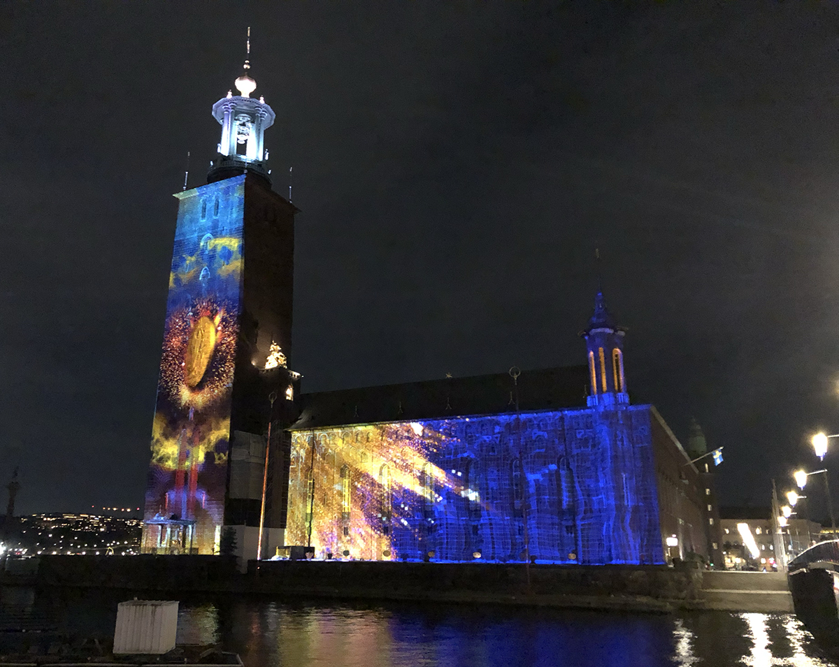
Nobel Week Lights is a light art festival scattered around Stockholm with a curatorial base in connection to Nobel prizes. It’s organised around December 8th and I visited it last year. The area covered by light art is quite large and I recommend more than one night for visiting the festival. Take your time for rest of the city and its galleries as well, for Stockholm is one nice city!

I t was also nice seeing students' artworks!
No blunders blunders by Constance Michnik Frederiksson


A Difficult Question to Start with 

I had a most interesting discussion about light art festivals and their diversity (or lack thereof) with one of the Nobel Week Lights curators, Lara Szabo Greisman from Troika. She asked me if I could name one artwork in the festival, that would best grasp the idea of Nobel Week Lights. In that hasty moment, I couldn’t, and the conversation galloped on, but the question kept puzzling me. 

Later on I realised there wasn’t one artwork that would be the icon of the whole festival for me. Rather, it would be the theme. Relating every artwork to Nobel prize winners gave me a specific, otherwise not-though-of way to view them. It connected the miscellaneous group of artworks into a solid whole. The theme was strict enough to give the festival a certain spirit but solute enough to choose variant artworks. That, I think, is genius!

A Non-Answer to the Original Question

Choosing one artwork representing the whole festival proved to be impossible but choosing one closest to the Nobel prize history would have been an easy task. 

Heroes by Smash Studios is basically a documentary about Raoul Wallenberg and Dag Hammarskjöld, in a projection mapping form. Stylishly accomplished, heartfelt and informative, on emotional and conscious level. A good competitor was Kroft & Smids’s Nobel Light Walk, a route of quotes of Nobel Prize winners, projected on unexpected surfaces. This, I think, would be a good starting point for a whole new light-literature festival! And of course, there is the large-scale projection mapping Conscience by Ateliers Bk, that really rubs the Nobel medal in our faces, with some sparkles, fluttery fabric, and a Phoenix bird, as is trendy in mapping these days.

"We remember" – I sure hope everyone does

Text and the City

Exploding / sparkling Nobel prize


Light Art Moving People

It’s nice to hear people scream, even if it’s just for joy. The seesaw called Wave-Field, by CS Design, Lateral Office and Mitchell Akiyama appealed to kids and adults alike, inviting them to the very simple and joyful interaction of seesawing. A tad more challenging interaction was found in Alexander Wolfe’s Kinesthesia, where approaching of lamp posts was demanded. Screams of joy still ensued, as people succeeded in creating a composition and a light show by running around the posts. 

Ack, ack, spegelns retrospection by Eva Beierheimer was aptly named, reflecting the spectator in front of it with a slightest delay, modifying the reflection in a very delightful 60’s OP-art way. Tove Alderin’s Orchestrated Entities_Chorus was advertised as interactive, but even after downloading the app and bellowing at my phone I didn’t quite find out how it should have manifested. It didn’t matter, however, since the artwork was beautiful on its own, without me or anyone else (but especially me) adding my voice to it.

Karl XII tells people to move it, move it

An orchestra of lamp-posts

Eva Beierheimer lures people to move it, move it

This artwork doesn't include me screaming


More or Less Minimalistic Artworks

I was quite impressed with the brave simplicity of Ljuset by Johan Thurfjell. The single projected candle became a statement bigger than its size or luxes. Also simple, but not quite small, Luke Jerram’s Gaia recycled the idea of his previous Museum of the Moon. There, a celestial body, in this case Earth, is placed somewhere where it doesn’t really belong, in this case to the Royal Palace. 

Julia Dantonnet’s Horizon is probably my favourite of this year’s edition. Based on an old trick of lighting design, it made light birds fly on the walls of City Museum. Being a close friend with minimalism, I’d be happy just with the birds, but I guess light art festival context demands a showy element, even if it’s just a colour changing light wash.

Not a piece by Elton John

Every man becomes an Atlas here

Flipping birds

Future Forecast

As a light art educator, I was super interested in the student section. Within and Against, a collection of student works, was compiled from site specific artworks around Serafimerstranden, realised by art, lighting design and curating students of Konstfack, Kungliga tekniska högskolan and Stockholm University, respectively. Few of the artworks actually used added light, the overall approach was quite conceptual and contemplating, making use of existing lights. I couldn’t find all the artworks, but based on what I did find, I expect to see interesting use of light in the Stockholm visual arts scene in forthcoming years.

The Drop by Karin Askling

My trip to Nobel Week Lights has been supported by Frame Finland, and I thank them with all my heart.