Wednesday, 12 January 2022

Locals on the spot

Ghent Light Festival 2021 showed a glimpse of the life of the Ghentians. And a spaceship.

Don't call the fire brigade, it's just art.
The big fire that never happened by Michael Langeder

Locals are everything

If I had to put what was special in Ghent Light Festival in one word (and I had to, for a presentation), I’d say it was Locals. Of course, there was the obligatory colourfully lighted square, Christmas decoration extravaganza and flashing light cubes, just like everywhere else, but there also was a lot of locals and locality on display, a certain pride of the city, even. That was seen in makers, artworks and making the city as a profound part of the festival. 

Touch of the locals was present in very concrete way in the hundreds of DIY-lanterns, sprinkled around the route, under the title Lockdownlights. The Ghent-inspired lanterns were delightfully motley and unexpectedly designed, just the way I like my lanterns. Also, they are an excellent way of lighting the way of masses indeed.

Another theme that knotted the festival to the city was the illumination of the existing graffiti and murals of Ghent. Illumination is not the best word here, since it was not just about lighting them pretty, but more about creating a new artwork based on the painting. Light-arted, maybe?

Simple and genius idea was to project faces of Ghent people on the trees of Coyendanspark, in Gentse gezichten by The Artpole. Coyendanspark is quite French style neatly cut garden, and reminded me of Peter Greenaway movies to begin with, and portraits of people looming on trees confirmed the ambience. As a Greenaway fan, I enjoyed that uncanny environment a great deal.


Lanterns leading the way

The Island by Klaas Van der Linden and tBEDRIJF shed a new light on a graffiti

Portraiture meets gardening in Gentse gezichten
 
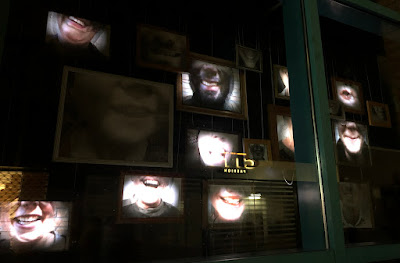
In Eindhoven, the laughing mouths of the locals were displayed, here it was the eyes.
Idipsum by Dagmar De Clercq.

Flashbacks from Eindhoven

The similarity of light art festivals is nowhere more clearly to be seen as in projection mappings. Even though artists and styles were different, some details reoccurred, compared to Glow Eindhoven, the previous festival I visited.

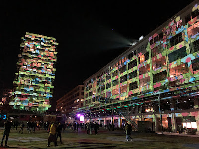
For a chance, Ghent’s large projection mapping artwork was not projected on a church, I repeat NOT a church. I’m amazed already! Quite many other boxes are checked in Supraluminique by Nele Fack & With Other Words: flying bricks, fluctuating façade, growing plants, moving shadows, possibly flames as well. And a huge, weird human-ish character emerging, pursued by naked ladies from antiquity, for no obvious reason. This is not too local a plot twist, since same happened in GLOW Eindhoven as well. Coincidence or Illuminati? Or maybe it’s a thing now? 

On another wall, a spaceship. In the bombastic Go for Launch by Create the spaceship wasn’t nonchalantly passing by like its counterpart in Eindhoven. Instead, we got to see the launch of the first Ghent based spaceship. A park with silos around it was transformed into a space fort that sent the ship on its way, with obligatory countdown. A lot of smoke, flashing lights and animation was involved. Kids seemed to love it.

A moment before the naked ladies appear

It's a reoccurring countdown

Serene Adult Content

The spectacle is always present in light festivals, but there was a good amount of more serene artworks in Ghent as well. 

Exhibit A: The Wave by Studio FAH. Even though I think the beautifully waving beams of light would have been quite enough to reach a seashore in my mind, without the tautology of water projection, I did find the artwork quite impressing in its calmness and vacillating strength. One or my favourites, definitely.

Squa­re Prism by Nathaniel Rackowe was like a surrealist, square poem, pretty far from a spectacle, a fresh breath from the high art world. I for one welcome the finally occurring mixing of festival and gallery art, it certainly invigorates both. 

Another literally poetic artwork was On Blank Pages by Luzinterruptus, embracing some old-school interactivity. A glowing hut, covered with booklets with empty pages, invited people to write whatever they wanted to tell the others. There were some dick pics, obviously, but most of the messages were content for adults instead of adult content.

Make waves for the light making waves!

Fine art in a tree

Here's my companion for the evening, Rita, writing her non-genitals-including message.
If you're lucky enough to know Finnish, love poetic writing and travelling, do check her blog Tällä tiellä!

The City as Venue, Including Useful Bushes

In the beauty pageant of cities of light art festivals, Ghent is a finalist at least. The old buildings and parks are great venues for light art and create a much sought for magical atmosphere. 

Especially Museum of the Moon by Luke Jerram gained from the environment. I wasn’t too excited about it beforehand, a big balloon with Moon print on it doesn’t sound too imaginative, does it? Let alone the artwork being quite the opposite of the word local, since it has been orbiting like every festival ever. But in the middle of the old Ghent buildings, in the perfectly chosen spot, defying the laws of nature, it was such an outlandish sight that I couldn’t help but like it.

Still Entity by Sarah Van der Straeten, Lisa Eisen, Rebecca Ackaert, Melis Deveci, Harm Buyck, Arthur Van den Storme and Kwinten Vermeulen made me look at the city in a quite another way than interactive artworks usually do. In this case, the delicate reflections and subtle chances of colours were the stronger the quieter the public was. The gentle beauty of the artwork might have been missed by many, amongst the more spectacular pieces, I'm afraid. I think it would be a great addition to permanent public artworks of the city, to be enjoyed in more tranquil season.

There was a seven kilometres long route around the city, where people walked quite shoulder to shoulder. I didn’t even consider walking it in one go. It was obvious that locals were used to watch the artworks while walking, so there were not too many bottlenecks. On the con side, this occasionally prevented stopping and watching an artwork for a longer time. For example, I would have loved to dwell in Humanescense’s (by Moni Wespi) cinematic ambience for some time, but stopping would have caused a chaos. In some cases, sidestepping in the offside bushes helped, but in that particular place there was no bushes to plunge into.

My first but not last encounter with Moon. 

Still Entity encouraged people to shut up

Uncritical mass prevented proper art watching

The concept of most light art festivals is pretty similar and the setup of the artworks interchangeable. What does make a difference, is the city itself and the way the artworks are placed. I think Ghent did this really well, and by emphasising the locality managed to have a human, warm final touch. Well done, Ghent!

****
Spectacular thanks to Niilo Helander Foundation, that has made possible my Grand Tour of Light Art, including the visit to Ghent.


Monday, 29 November 2021

Rhymes with WOW

GLOW Eindhoven is one of the biggest light art festivals in Europe, reaching its 15th edition i 2021. There was something old, something new, something recycled and something cold flickering blue.


Lights! Colour! Prepare to be amazed!
Water Wall by Aquatique Shows

Decentralized light art in a city with electrical history

The city as a venue does mean a lot to the overall ambience of the festival and so does the route. Eindhoven does have a place in history of lighting, since it’s The Philips City and you should visit the museum. But it is not the prettiest city of the Netherlands. The route did, however, show different and quite interesting areas of Eindhoven. This year, the artworks were scattered all around the city, in three main clusters with a couple satellites added. I had three nights to spend, and I do say it was not too much – even though I skipped most of the satellites. There was some extra walking (and, occasionally, fence hopping... a friend told me), since the map didn’t show which areas were fenced and where to get in. There is some room for improvement there.

The bold buildings of the city were used well as material for artworks. My absolute favourite was Eye of Atlas by a team led by Philip Ross and Max Frimout. The existing lighting system of the Atlas office building was programmed for light to breathe, linger and slide in the building, with an immaculate sense of rhythm. The Rainbow (a tad obvious name, I'd say) by Rik Verschuren and Tim van Stiphout was a beautiful display of colours, but a less daring bet in the inhouse light game. In this case the colour scheme was an argued decision, not just running through the whole colour spectre because you can, I'm happy to say.

A chord in the Eye of Atlas symphony
A colour variation of Rainbow

Laser tag war with a church

As with pretty much every festival, GLOW had a large façade projection mapping show. The canvas was a church, a very popular choice in projection mapping. Domus Luma by Yann Nguema had quite an organic flow in the animations, which made a big difference compared to the usual engineery punctuality of most projection mappings. Even though there was fair share of flying bricks and crumbling walls, there also was some unusual stuff, like lasers combined to projection. It’s much more fun to see a church falling apart, when it’s done with lasers! Another trend I’ve noticed in projection mappings: a human-ish character appearing for no apparent reason. Here it was a shiny hunk with a huge banana on his shoulders. 

That must be one heavy banana.

Topical lanterns

Self made lanterns forming a collective artwork have, indeed, become quite inevitable in light art festivals. I feel really at home here, since I curated the Lantern Park of Lux Helsinki festival for six years. So, guilty as charged. Of course, Lux Lanterns is the bestest of best lantern collection, but it is nice to see other people doing just as crazy stuff elsewhere. In Eindhoven, however, I was getting desperate not to find any lanterns at all, but finally found some – in a bar! How suitable, since the lanterns have been made by students. Points to Eindhoven for placement and a supportive theme!

The New Mutants lantern project was led by Har Hollands

From big and bold to blunt and blue

I remember seeing my first colourfully lighted town square in Pécs’s Zolnay light festival some years ago and I remember thinking wow this is something different. I was wrong, of course. Many festivals have their own version of this theme, and I cannot complain, it is very nice indeed. In Eindhoven the square was huge and there was a building to go with it and there was a colourfully lighted industrial space as well! Overwhelming!

Footprint at Ketelhuisplein was a project led by Hugo Vrijdag, with kids of Eindhoven, who drew the images seen covering the area. The artwork is a comment on the Dutch ecological footprint, and I'm sure the electricity needed for the piece is produced by windmills. In a weird way, Footprint managed to be cheerful and dystopian at the same time. It must be the combination of flowers and eerie green light.

Ode to Light (oh, come on, have some imagination with the names!) by Daniel Margraf was more evidently merry. Bright colours, fairytale characters and tropical birds transformed the industrial space into an enormous eye candy store. What a stark contrast was the next artwork, Falsche Frage by Charles Vreuls! With its blunt blue-white warning lights flickering almost violently in silence, it certainly was not pretty. But it was impressive. 

A green Footprint

Industrial hall in bloom

These lights would probably scare the moths away

Christmas is coming

The line between decorational lights and light art is blurred, especially at light festivals, especially before Christmas. Valerio Festi's Porte Celesti, with 25 light gates around the city are very much based on the baroque aesthetics of abundance and ornamental. I would rather call them decoration, with a strong skill in craft. Mind you, decoration is not a bad thing, when done properly. Here it most certainly is.

A good example of meticulous craftmanship

Different kinds of site-specifity

The Window Expo was a great idea to involve local organisations and businesses, I think. Since the artworks were often quite small, it became a kind of treasure hunt to spot them in the shops' windows. The artistic level was varied, yes, and often the artworks didn't quite stand out from the usual window display, but that was maybe not the main point here. Muziekgebouw's Hahaha (by Marijn Smits, Laurie Roijackers, Isis Boot, Luuk Thijssen and Mandy Ouderland) was one of the tops of this entity, I think. 

Gijs van Bon's Ping is a product of GLOW Eindhoven 2018, now renewed and replaced to the worksite of Nanjing Pavilion. Whether the worksite of the venue is genuine or specially staged for Ping, it matches very nicely with its board constructions and makes the artwork even more site-specific than originally. The artwork first hit me like what the hell is this raving hodgepodge? But while wondering that, I grew quite liking the invisible high speed roller coaster, roaming around fiercely, hitting the wall like flaming Harry Potter, very late from the Hogwarts train. 

Smiles of Endhovians in Hahaha

Light hitting the wall in Ping 

Moving strictly and broadly at the same time

All in all, the festival was pretty much what I expected and what light art festival usually are: things of beauty, joy and amazement. The search for WOW effect was evident: most of the adjectives in media material were likes of stunning, incredibly impressive, huge scale, gigantic, beautiful effects and images, wonderfully enchanting and so on. You get the picture. 

The slogan for the year was "Moved by light". Yes, there were some artworks that encouraged actual moving, and yes, light moves us also on emotional level – but that goes with all light, not just the artworks in GLOW. This is an issue with themes: if you have a specific one, it might prove difficult to stick to it and if you don't, the exhibition may end up amoeba-like mishmash. Not that anyone cares, except some deranged curators maybe. Often, I think, the themes are picked just because you have to have one, without really thinking about the content. 

But this is material for another article entirely.

People moving vigorously


Other people visiting Glow Eindhoven

Tripadvera (in Dutch)

***
Unbelievably big thanks to Niilo Helander Foundation, that has made my Grand Tour of Light Art, including the visit to Eindhoven, possible.

Thursday, 11 November 2021

Drop the Light Art!

Projio in Tampere is an interesting media art festival, that would do just fine without the light art appendix.

I loved the compactness of the Projio festival 2021. Just one building and six artists! Well, the VJ competition made a bunch more, but still. It was so much easier to concentrate to the art works with no pressure of seeing five hundred more, or walk miles to get to those five hundred more artworks. I also appreciate the curating of the festival: most of the art works had something quite meditational in common, but they were in no way too similar with each other.

Having time for concentrating was especially important with Yu Hsuan Yao’s Séance, with its intensifying dramaturgic arch and visual finesse. Projected on multi-layer gauzes and screens, the piece depicts a Taoist ritual in 360°. It’s not documentary, though, but gives a somewhat trancelike, even part-taking feeling when watched long enough. At least it did for me.


Ghosts or people? Doesn't really matter in Séance
Photo: Katja Muttilainen

Folding abundance of Visual Meditation

Patterns dissolving in Dissolving Patterns

Teemu Raudaskoski also used gauze in his Visual Meditation, but more for softening the image than layering it, I reckon. The gauze also emphasized the abundance of visual material, consisting of recognizable forest imagery, shattered, distorted and then recomposed. The overwhelming amount of material could be observed as separate details, but I enjoyed the general composition, which made me think of fruit and flower stilllebens of the 18th century. Except, of course, that the leben here was not still at all.

I was impressed by the near-abstraction and genial site-specifity of Janne Ahola’s Levottomuus (Restlessness) in FLASH Vallisaari exhibition some years ago. Projio's Dissolving Patterns, projected on the façade, was more of a flying bricks and twisting towers kind of traditional projection mapping piece. I know, everyone and their cousin love this awe inspiring style, but I for one sure hope to see mr. Ahola’s further forays into realms of non-geometric subtlety. 

Suvi Parrilla’s Kemiallinen kirkastus was subtle all right, even to the point of non-visibility. I’d like to think that was intentional, since the theme of the piece is disappearing of fish, caused by chemical clarification in lake Mikkolanlammi. Non-striking doesn’t mean non-interesting, I should add. White contours of the fish, floating gracefully around the façade, with added colour splash every now and then, were visually and thematically very thought of. 

Barely visible fish in Parrilla's artwork

Soft glow and crispy lines in Teemu Määttänen's Fold

If I'd do anything as tidy as Määttänen ever, I would show it to the world, too
Photo: Katja Muttilainen

Antti Pussinen's glowing globe

White lines were in an even more important role in Teemu Määttänen’s Folded. According to the name, the canvas was made of meticulously folded pieces of cardboard, where the projected white lines flowed across the ridges. This beautiful study of light and form is a close relative to a previous artwork of mr. Määttänen, Atlas Tree, where similar lines stroked a trunk of a tree. Then again, I don’t recall that many artworks by Määttänen, where white lines did not play a part. Not that I’m complaining, white crispy lines are one of the things that make life worth living!

I have previously seen Antti Pussinen’n Nth wave in the Oksasenkatu 11 gallery in Helsinki, where it floated in its own solitude in the gallery, behind the window, quite ominously. Here the display was quite different, but the somber beauty was still there. 

I’m not too familiar with video jockey culture, but I do find the accompanying VJ competition, organized in cooperation with Tampere Film Festival, to be a great idea and an example of good synergy. The huge wall of the Vooninki building made a good canvas for the projected art works, with its light surface and distinctive details. The videos were not the projection mapping kind I expected (and feared), but more like short, somewhat dreamlike movies. Every artwork had the same music, which I understood was a starting point for the artists. I have to say, though, that I didn’t sense a super galactic mind-blowing connection between the videos and the music, and I even dare to wonder why this particular, quite ambient music was chosen.

VJ Vixen's Primitives was my favourite for simplicity,
60's style bold colours and considering the façade's details

Projio is advertised as media and light art festival, but the light part was all but nonexistent. Yes, there was some light stuff around Vooninki building, but the name of the artist was not easy to find. Actually, I can’t even say if I did. So, light art clearly wasn’t the focus here. Also, light art is part of media arts, so no need to mention it separately. Also too, nice area lighting doesn't have to be called light art. Also three, I think the video art was quite enough, and there are about gazillion light art festivals already anyway. I don’t say this often, but forget about light art, you’ll do just fine without!

I wouldn't call it art, but the lighting around Vooninki was nice.
Photo: Katja Muttilainen

Bonus Track

My guide this evening was Katja Muttilainen, who knows Tampere, light and especially light in Tampere well. Some of the photos of this posting are by her, since she has a less shitty camera and more talent than me. In addition to Projio, we visited a brand new tram stop light art work by Jaakko Himanen and checked the lighting of Tammerkoski rapids by WhiteNight Lighting. Both were super. We also had a hearty dinner at Tuulensuu gastro pub, where Katja explained my erratic behaviour to the waiter: "She's from Helsinki". You know, there's this friendly-ish competition between the cities of Tampere, Helsinki and Turku, and we like to mock each other when ever the opportunity arises. Mocking me for being from Helsinki was totally okay, of course, since it was a punch up.

The weather was inhumane, but wet ground sure served Jaakko Himanen's art work well


Tuesday, 19 October 2021

Aaltoja! Light and Sound in Kotka: A Good Start with Bold Colours

Kotka has joined the cities with a very own light and sound festival, Aaltoja! (Waves! In English) 13.–16.10.2021. There was some sound all right, but the main attraction certainly was light. I visited the festival during its final day and found it to be a solid start for hopefully long run in the future.

So, what is special about Aaltoja! Festival?


Fish of the Fairy land

Professionality

Let’s start with organising, which was quite professional. The look of the whole thing, including web pages, was refreshing and inviting. And pink. Which automatically makes it good. There were food trucks with actual food in them, for quite many tastes. Lots of people, but not too much rush. 

Lighting and light art are not quite the same thing, which is not all too clear even for professionals. Neither is better than the other, they just are two different things (with a load of grey area between them, I admit). I was quite impressed that the website listed “light and sound artworks and lighted venues”. And. Love that word there. Very adept.

Just one exception: I would have liked to know the names of the artists and designers, in addition to the firms they work for.

Scale

The scale was perfect. There were plenty of artworks, but not too many, and they were in a reasonable walking area. The route was free but logical and easy to follow. For most. One got to walk enough, but one also had time to visit all the venues even if one got lost, proceeded incoherently and had a few pit stops by the food trucks. 

Locality

Sure, there were some pieces that have been displayed elsewhere, but mainly the festival brought out local buildings via their spirit and not just as canvases – and to some extent, local artists and designers. The theatre house is a good example. The light design was quite traditional, but adding local ingredients, like clips from performance recordings and chairs used in plays, made a great difference.

Theatre is chaired by the audience


Also, one of my favourite pieces, Niko Tiainen’s BINARY:WAVES was not just transported from its previous venue but rethought for Kotkansaari old hospital building. The black and white waves washed the walls soothingly, while ones and zeros disappeared and reappeared under them, contrasting nature and strict digits. In my interpretation, anyhow.

Binary writing on the wall

The Kotka county hall is one of the most boring buildings I’ve ever not even noticed, but by golly, it is a great canvas for light. Sun Effects’s nominal Aaltoja! (Waves) introduced the theme quite literally, with different kind of waves, including sound and heartbeat graphs, backed by a water like churn of colours. Simple and beautiful. 

Waves of another kind

The rest of the buildings were lighted with bold and striking colors, the most vivid example being the Haukkavuori lookout. Kotka church was lighted to emphasize the redness of the brick walls, with contrasting tones in the windows. The chosen colour kind of made the church look even more phallic than it already is, with the white splash on the tip not helping. Or maybe it’s just me. 

Probably. 

The tower


So, the colours were abundant, but I didn’t catch even one sample guilty of my pet peeve: running colours through the whole spectrum, just because it’s possible. 

There is progress, after all! 

Local contribution to the festival


Friday, 17 July 2020

Helsinki Public Art, the Nonconventional Edition

Helsinki has its share of huge metal lumps, in boring shapes of important middle age white men from the days past. Luckily, there is another kind of public art too, well worth seeing. Or hearing. Or even experiencing. In this first part, I'll list some of my own favourites in the central Helsinki area. Outskirts of Helsinki will follow, one day. Of course, there's a map, which will be updated as I go.


Holy Cows of Intersection

Artist Miina Äkkijyrkkä is known for her fondness of cows. They're a recurring theme in her works, including textile patterns, paintings and graphics. She has studied husbandry and even maintained a herd of eastern finncattle herself, even though that didn't end too well.

In Finland, cars are often regarded as holy cows of a kind, and Äkkijyrkkä indeed uses cars and car parts as material in her cattle themed sculptures. The ones in Hakaniemi, called Joy (2006) are of a smaller kind, the biggest may include a whole van in the body of the cow. And what could possibly be better place for these statues than a busy traffic intersection?

Getting this close is a tad dangerous and probably illegal, since
you have to cross a few car lines with absolutely no pedestrian crossing

Golden Showers in the Harbour

Manneken Schmanneken, we have it bigger and... more endearing? Tommi Toija's Bad Bad Boy (2013) was originally exhibited in Sweden, and in Finland first installed in front of the presidential palace, but only temporarily. Wonder why. In 2015 it was once again re-erected in Jätkäsaari, on the grounds of Verkkokauppa.com store of everything, welcoming people arriving from Tallinn by boat. It was supposed to be, again, temporary, but there it still stands in it's 8,5 m glory, years overtime. Which is great!

At first, the statue stroke me as horribly ugly, but on the second sight I began to see the laconic humour and appealing bluntness of it. It's kind of cute in the same way as a baby owl. The body of work of the artist Tommi Toija includes a lot of characters similar to Bad Bad Boy, just smaller and more hazardous in their looks, on the edge of horrible and heartbreaking. Judging from the internet commenting, not all bother to look twice, and/or see Bad Bad Boy merely as a joke. I beg to disagree. And dare you to take a shower in the jet on a hot summer day.


"Never mind me, I'm just on my way..."

Sound Art Hidden in Plain... Sight?

Every day at 5:49 pm, ever since 2005, there is a 5 or so minutes of sound art to be heard in the Senate Square. The likelihood is that uneducated ears don't even recognise it, since Senaatintorin ääni (The Sound of the Senate Square) is composed of very church bell -like sounds and thus is easily mixed with the bells of the actual church by the square. But they are not quite the same.

The sounds emanate, in turn, from different rooftops around the square and every version is different. The work is not just recordings of different bells, but an electronic composition by Harri Viitanen and Jyrki Alakuijala. If you really want to feel like in the know, linger by the statue in the middle of the square, listen to the beautiful sound art and scorn the tourists (and Helsinki dwellers) around you, who have no idea there is art going on.

The art work is audible on the whole square, but the best place to listen is the
area around the statue of Alexander the II, marked with white square in the image

Art under Your Feet

One probably notices Denise Ziegler’s public art works by accident or by already knowing what to look for. Even though I’d very much like the crowds to find them, the subtlety is a part of the poetic charm of the works. Epigrams for Helsinki Citizens (1999) series consists of eight manhole covers, spattered around Helsinki centrum, every one of them adorned with a sentence defining the site in a more or less poetic way. Here the text goes ”in the backroom of the city you’re enjoying the sea view”, which is very much true behind the market hall.

Note the more than fitting cigarette stub.

Sounds from Sewers

Markku Puustinen's Mutta minä lähden (But I shall leave) has been reciting under Torkkelinpuistikko parklet since 2003. The well pronouncing voice utters notifications of flights departing, heard from the sewer in the corner nearest to Avikainen bakery (which supported my wellbeing during my years in the nearby arts high school with their crescents and munkkis, so that you know).

At the time I first heard the piece I regarded it quite optimistic, as a kind of dream of freedom. Now, of course, this has all changed and the voice feels more like a harbinger of the inevitable doom. During the winter the art work hibernates, since the the battery can't stand the minus degrees. Let's see how the climate change will affect that.


The horror here is way more cerebral than in Stephen King's IT

Some Lumps are Okay I Guess

OK, these are lumps indeed, but not made out of metal, nor in shape of men. Even though Maria Duncker’s six part work of huge pieces of stone, Too Heavy Guests (2010), remind me of Pushkin’s play The Stone Guest, the awkward creatures still feel friendly to me. There they stand, a bit mopey, somehow in a wrong place and yet part of the community of buildings around them, old and new. I especially enjoy the combination of roughly chiseled stone and the finest detail of traces of decoration on their surface. No evil thing would have a tattoo of a jolly candy kane on them, would they?

I spent a great deal of time trying to figure out what's the deal between these two.


Wednesday, 26 February 2020

Trajectum Lumen: Orienteering by Light Art

Trajectum is the ancient Roman name of Utrecht, and Lumen is the unit of luminous flux. And a metabolism hacking device. And a Russian rock band. So that you know. Trajectum Lumen is a light art route meandering through Utrecht's ancient Roman center, luckily consisting of quite different light art works than those favoured by ancient Romans, especially emperor Nero. Like, flaming cities and humans.

The given estimates of the time needed vary between one and one and a half an hour, plus a likely visit to a bar, but I'd recommend at least two hours. And a visit to a bar.

Light Art Inside, Outside, Upside Down

I was a tad prejudiced when entering Erik Groen's Tunnel, since in the publicity photo it looked like another spectrum-wanking wondertube, of which there are way too many. I mean, we all know that it is possible to mix all the colours with RGB LEDs, but that really is not a reason to do so. It really isn't. Anyhow, to my great pleasure the colour variety was, if bright, still actually thought of, and even the less fanciful combinations were present. One could spot the unavoidable rainbow at times, yes, but it was just another colour combination among others.


© Merijn van der Vliet / Utrecht Marketing
Jan Hein Daniëls and Willem Hoebink's installation Pausdam was possibly the most spectacle-like of the lot, but definitely not too flashy. The cool hues of blue and white alternated fluently, although a tad mathematically for my taste, kind of lacking tension, but this really is a question of preference. On the other hand the projected hare and owl had been given more time to breath, so to say, and take their time and space, which was a nice contrast to the lights' punctuality. I wouldn't call this a ghost house, but the ever so still and finally alive-coming animals really gave an eerie finishing touch to the whole.

© Merijn van der Vliet / Utrecht Marketing

Halo
by Titia Ex at Sint-Willibrordkerk was one of my favourites. Simple, beautiful and integrated to the site on a thematic level and in a most elegant way. And funny, too! I wonder if it was on purpose, but the colours of the halo perfectly matched the surrounding Christmas lights, in a very who wore it better way (the halo did).


As soon as one realises there are small orange lighted arrows in the ground, the route is easy to follow. Sometimes the art works are a tad hard to spot, but the small blue eye signs on the ground give a good clue where to stand. Before I realised this, I did roam around the Drift like a desperate human snooker ball, in search for video art by students of the Utrecht School of the Arts. Which I, luckily, did find, and I have to say, the site was genial! A perfect example of making unnoticed parts of a city visible and meaningful. But not too visible to take away the joy of finding the art in a surprising place.

@ Anne Hamers / Utrecht Marketing
The Sun Shines in and around the Buurkerk by Gabriel Lester loans the shapes of the windows of the adjacent church, err, museum, adds some colour and turns it upside down. At the first sight the work is not nearly as fancy as in the photo, but once I got the idea of it, it quickly became a thoughtful study of blurred borders between inside and outside, a statement of belongingness and surrealist caricature of a decoration. I think.

Dead lights and missing mist

The lights by the Janskerk made me go like Oh, the lights are... changing? What am I suppose to... What? Given the benefit of doubt, I believe there was something wrong with the focus of the lights at the time of my visit. Another victim of dead lights was The Fortified City by Okra Landscape Architects. Not quite as fancy as in the publicity photos, I'm afraid. Some natural/artificial haze would probably have made the day, though.


As the webpage duly warns, some of the works may not be working properly or at all – being a year round project takes its toll. I did miss a bunch of artworks either/or for being out of order or missing from the map. The two may be related. Then again, I'm pretty sure that maintenance is not lacking because caretakers are stupid, lazy and hate art. I'm betting on deficit in resources. So, whoever is funding Trajectum Lumen, give it some more tender love, caring and money, please, so it can live up to its potential.

Cosiness is the key

Many of the commentators in the social media describe the art works as "nothing spectacular", which I mostly agree on, but do not see as a problem. All too often spectacle and flashiness is regarded as imperative to light art, which simply isn't true. Trajectum Lumen artworks draw attention to the city itself, and I just love the idea of orienteering the streets by light art works! The cosy, small scale of the artworks give room for both the art and the city, without one being just a canvas for the other.