Friday, 20 September 2019

Blinded by the Light Art of Venice: Biennale area

Too much art is certainly a first world problem, but it does get real when you're in Venice during the Biennale. In order to survive the emotionally suffocating amount of art in the city, one can start with concentrating on one aspect of art. In my case, that was obviously light in art.

Remembering last editions of the Biennale, light played a lesser part in the works in the Giardini national pavilions. The main exhibition there lacked light in the number of art works, but the sheer amount of it, when used, was often pretty considerable. Even painfully so. In the Biennale's Arsenale site, however, light was widely used. In some cases it took the lead, but mostly it was used in supporting roles. There were also quite an amount of sporadic light and lightish art in the national pavilions spattered in the city, outside Giardini and Arsenale, of which I'll mention a few. The non-Biennale-related exhibitions had their fair share of light, too. A fair, fair share.

Giardini


In my posting about Prague Quadrennial scenography show I briefly brushed the theme of thin line between scenography and fine arts. I was happy to find a reason to smile smugly when I found this piece in the Russian pavilion. The artist was also on display in PQ, which totally proved my point. Alexander Shishkin-Hokusai's coulisse had some more mechanics involved this time, and some whimsical neon light, too. Blatantly old fashioned and wonderful!


I though I could stand any amount of light, with my vast experience with it, but no. I just had to close my eyes in front of the painfully full radiance and walk half blind through Ryoji Ikeda's spectra III in the main exhibition. First it got me really irritated and wondering why is this done in the first place and is it even art and my imaginary child could have done this and after a few hours of pondering I realised I had been thinking quite the essential questions of art. Well done, Mr. Ikeda, but I still hate you!


Venice's own pavilion has lately been quite the Liberace of the Biennale, putting forward everything shiny and expensive la Serenissima has to offer. Luckily, this year it had a more distinguished and subtle approach to the essence of the city. I especially enjoyed the immersive artwork by Plastique Fantastique and Fabio Viale, which grasped both the romantic and melancholic atmosphere of the drowning city, quite haptically, without unnecessary embellishments.

Arsenale


Here's an example of not often seen political light art. Tavares Strachan's Robert Henry Lawrence Jr here is one of mr. Strachan's pieces about remarkable persons, faded in history, most likely because of their gender and colour. 


It was nice to watch the breathing hues of these "corals" and I do appreciate military materials used for art rather than war, but somehow the piece by Christine and Margaret Wertheim was a little too showcase-y for my taste. However beautiful the electroluminescent wire was, it still was just electroluminescent wire. With nice colours. The context, however, brings some content to it: the other pieces of Crochet Coral Reef are handicrafted corals, commenting the great barrier reef and the possible loss of it. This one was taken aside for the darkness it needs, I presume.


Korakrit Arunanondchai's No history in a room filled with people with funny names 5 was another example of the thin line between using video as media or as light. Sometimes the information of image was the main point of attention, sometimes the screens were filled with pure abstract colour fields, making them luminous sources of light. This, of course, defines if the art work falls to category of video art or light art. Which is a question no one but an obdurate classifier, such as myself, should be bothered with. 


Hito Steyerl's piece This is the Future included some accidental light art in the form of most wonderful reflections. And yes, I'm a fangirl looking for any excuse to include Steyerl's work here, even though it's pretty obviously not light art per se.


Here's one example of increasing use of light as material for an artwork. Alex da Corte's Rubber Pen Devil is a hilarious series of videos of Satan and his pals, shown in a neon framed auditorium. The light in itself was definitely not the main attraction of the piece, but it did bring a certain kind of modernist-decadent mood to the space and thus to the experience of the videos. This was not just well designed, unobtrusive lighting, but very precise part of the artistic whole.


Most of the attention in the Indonesian pavilion was stolen by the big ferris wheel in the middle, but pretty soon my interest was stolen away by the light numbers on the ceiling. I couldn't quite catch the idea of them, nor did I find information about the piece. Which probably was there right in front of my eyes. Anyhow, the lights of Lost Verses by Handiwirman Saputra and Syagini Ratna Wulan really got me thinking, wondering even.


Not in any way technically amazing or visually staggering, Synchronocity by Apichatpong Weerasethakul and Hisakado Tsuyoshi wasn't too easy to get, lightwise. I still don't know if I did, since after wondering, what's the light gimmick here, what with the fading bulbs and random general lighting, I realised there isn't one. By then I was far too mesmerised by the piece for not liking it so, yeah, I could say it really caught me. 


Even though Saules Suns by Daiga Grantiņa in the Latvian pavilion didn't include light wow effects either, the quasi sloppy untidiness felt a bit arrogant to me – even though there was something interesting in the use of light, when I really put my mind to it. I'm all for messiness, that's not the problem, but I quite felt like someone is inventing the wheel again and making it crappy on purpose.


I do love me some good neon allright, but this particular work by Gabriel Rico, I think, was in a wrong environment in the hallways of Arsenale. The placement made the work seem diminished, something taken to the corner, out of way. The surreal in the art work was nullified into awkward by mere misplacement. That's a bummer, since mr. Rico seems very interesting artist, especially by his use of light.


Hypersonic Hyperstitions by Marko Pelhjan of the Slovenian pavilion was probably one of the most photographed pieces in Arsenale. It was also one the pieces whose message was lost on me. Later Google told me all kind of interesting ideas about hypersonic weapons and stuff, but at the site all I could think of was a vehicle commercial from Galactica. Or this: 


There seems to be a certain trend in the use of light in contemporary art, which could be called souvenirism. The light emitting materials used in this kind of art include, indeed, actual blinking souvenirs, but also motley selection of other shiny bric-a-brac. 


Here's just two examples of many: Lee Bul's Aubade and Tracey Snelling's Shanghai/Chongqing Hot Pot/Mixtape. See also Thailand's pavilion, later. Snelling "gathers information through the process of wandering, observing, participating and documenting", which is pretty much what tourists do, and thus matches my self-invented -ism perfectly.


After the long walk of multi layer of meta levels art pieces in the Arsenale's never ending corridor, it was a relief to see some sunlight. Call me easy, but I enjoyed tremendously A Place without Whence or Whither by Chen Qi, an outdoors extension of Chinese pavilion. The idea was simple, pretty much from a course of lighting design for beginners: holes in surface where the light gets through and makes nice patterns on the other surface. That's what we do in theatre all the time. The work really was border line kitschy, but it didn't try to disguise in any kind of deeper philosophy, which I do appreciate. It was what it was. Just lovely!

See also:
Blinded by the Light Art of Venice: Other National Pavilions
Blinded by the Light Art of Venice: Other Exhibitions

Blinded by the Light Art of Venice: Other National Pavilions

These days, a lot of interesting Venice Biennale stuff is to be found outside the official exhibition. Here are some interesting examples, light wise.


Thailand's pavilion is situated right in front of Giardini, in a restaurant. Or, more precisely, in a room between the dining area and the kitchen. It's a blatant collection of souvenir kitsch, lit with equally kitsch ever changing LED lighting. Restaurant patrons looking for a toilet and staff looking for patrons who are looking for toilet give the exhibition experience an extra layer of dead pan comical je ne sais quoi, which couldn't possibly be created on purpose. Highly recommended experience!


I have a soft spot for Azerbaijan after teaching some very talented and wonderful art students there, and I admit that otherwise I wouldn't probably have visited Azerbaijani pavilion in the first place. I'm glad I did, since there was some fractal style light meditation to be found there, in the shape of giant ever changing ring Globe by Kanan Aliyev and Ulviyya Aliyeva. I'm not surprised that the name of Aliyev was ever-present, since nothing in Azerbaijan seems to happen without an Aliyev, the president Ilman, his relative, or at least Heydar Aliyev foundation, founded to celebrate the memory of previous president, the father of the present one.


I wonder when I'll learn to schedule my art staring trips so that I'm not totally overwhelmed by the share mass of art seen. Probably next year. Always the next year. Anyhow, in between all the full packed exhibitions, Montenegro's quite minimalistic pavilion, An Odyssey by Vesko Gagović, was a much welcomed piece of mental reboot for me. The few large boxes with light glowing from beneath disturbed my sense of gravity in a most pleasurable way. As I lingered between them, other visitors came in, and I could read their minds: "Oh, boxes" as they exited right away. What's wrong with people these days! They were AWESOME boxes!

See also:
Blinded by the Light Art of Venice: Biennale area
Blinded by the Light Art of Venice: Other Exhibitions

Blinded by the Light Art of Venice: Other Exhibitions

Besides the official Venice Biennale pavilions, there are loads of other high and low rank exhibitions to see as well. It's nice to see the old and middle aged masters, but it's even more fun to stumble upon exhibitions of talented young artists, unable to advertise with larger than life ads along the canal. The latter did not include that much of light art this year, so not many mentions here, but take my word!


Dysfunctional in Ca d'Oro was a quite interesting hybrid of art and design. Light was present in many forms, mostly as lanterns and reflections. The interactive mirrors of Audience by Random International followed the visitor, who all of a sudden found herself to be pretty much in the center of everything. In addition to that, most beautiful reflections when Sun is shining. The oil-like colourful reflections of the venetian windows on the surface of the glass bubbles, called Moments of Happiness, by Verhoeven twins, are just perfect excuse to post photos of the said, quite cliché, windows. Because it's art, you know.


Visiting palazzo Fortuny is one of my musts in Venice. Not only for the usually interesting exhibitions there, but also for Mario Fortuny. When discussing mr. Fortuny with two friends of mine, I first mentioned that he was a big shot in the history of lighting design, then a couture interested friend added that he also invented bias-cut and the third friend asked if he was the same guy who designed the pattern of their couch pillows. Well, yes he was. Quite a multi talent man.

One of the most famous of his inventions (at least among the three people in the world interested in the history of lighting design) is the dome theatre with almost a realistic sky, pictured above. Also, the downstairs gate to canal usually is involved with some kind of lightish art. Now on display there was Fuori Tempo, a simple colour field work with gels by Francesco Candeloro.


Reagents in Complesso Ospedaletto displays some neon art by Arthur Duff. There's always room for one more work with neon letters, but the staircase of Ospedaletto really makes the visit worth while.


According to my social media flow, Yannis Kounellis seemed to be one of the hits of this year. I have to say I quite liked the exhibition, but more from an art history perspective than my own personal liking. The insta friendly golden wall was quite impressive, but the flame series was more of interest for me. First I though the propane tanks were purely conceptual, but then the guards announced that they were to be set ablaze in a moment and I felt so privileged to see that. Such a joy to see thematic, not just decorative use of light.


The Personal Structures series of exhibitions in palazzos Bembo and Mora and outside in Giardini della Marinaressa was probably my favourite. Loads of different techniques and styles, even more rooms to endlessly follow each other and some works interesting also light wise. For example Footprints, the light tube work by Wild Flag Studios animates the tubes according to current immigration data. Already the second example of political light art here. 

I think Daniel Pesta's Top Secret Chain also quite falls into this category, with its shady bunch of important men alighting their hands and stomping the fire out in turns, quite ritually. Kouji Ohno's Quantum Fluctuation was pretty interesting, but then I read the info plate and the work was spoiled by way, way too much and too detailed information. You just don't start with science lecture, add all kinds of philosophies, throw in some human existence and end up by describing what can be plainly seen. You just don't.


In Punta della dogana's Luogo e Segni exhibition, light was present in more conceptual forms. The dead-yellow greenhouse lights of Mesk-ellil by Hicham Berrada emphasised the artificial effect of light rather than its beauty while Roni Horn's huge, visually intriguing glass objects of Well and Truly changed elementally according to the position of Sun. Yes, I waited quite long a time to be sure. Then there was the chandelier We Are In Yucatan And Every Unpredicted Thing by Cerith Wyn Evans, a big name in light art. I enjoy a low hanging, abundant, Murano-style chandelier as much as the next guy, but the artistic idea of this piece escaped me. Maybe it's because I've seen approximately gazillion flickering bulbs before, with or without a chandelier. 

See also:
Blinded by the Light Art of Venice: Biennale area
Blinded by the Light Art of Venice: Other National Pavilions

Friday, 5 July 2019

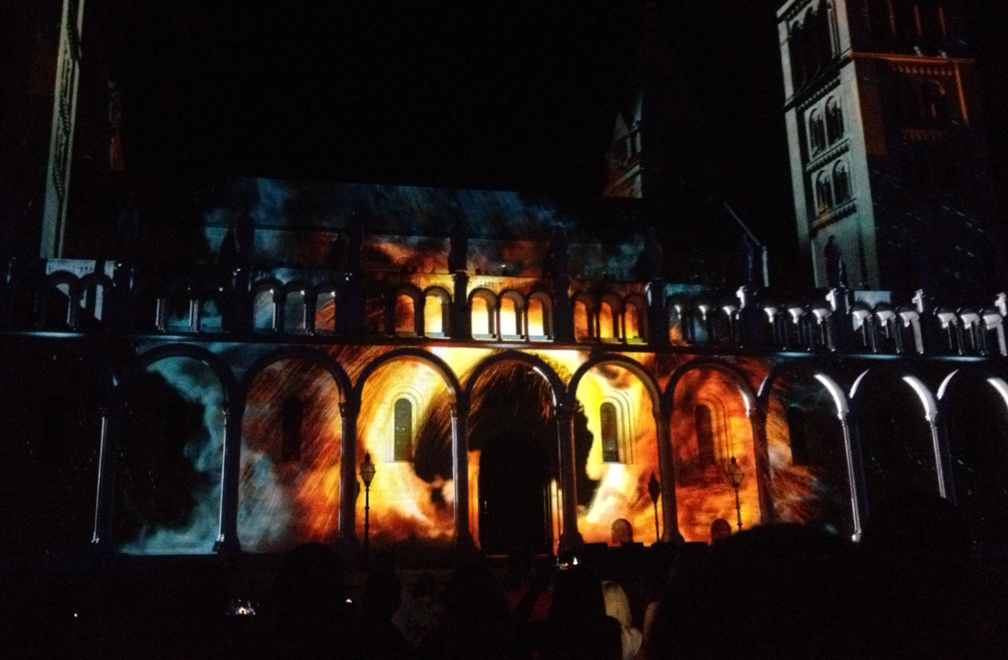
Flying Bricks and Twisting Towers: Projection Mapping Drinking Game

You know projection mapping, the technique where video is projected on a (usually 3D, large) surface, often a facade of a building? Then the carefully planned image material changes the surface in amazing and magical ways and makes you go all oohh & aahh & WOW. Right?

In my opinion, that’s usually all they do. Mapping is a wonderful and exciting technique, which easily goes to waste when it's only used for showing how wonderful and exciting it is. I've seen quite interesting things done with it in smaller art works, but when it comes to large scale projection mapping, the art disappears in an avalanche of effects. Which are pretty much the same in all pieces.

Escherian stairs. A classic like Sex on the Beach.

As we say in Finnish: Eihän tätä kestä selvin päin, meaning I just can't take this shit sober. To help people getting drunk enough to stand the horreurs of generic projection mappings, here's a little drinking game. Have a sip every time one of these happens:

1. A tower or a column gets twisted like a screwdriver. Take two drinks, if this happens Rubik's cube style.
2. A planet or a meteor appears. Take two if it's Earth.
3. Building blocks of the house are reorganised. Take two if a wall comes tumbling down.
4. The surface of the building fluctuates. Take two if this happens to the beat of music.
5. Shadows move. Take two if it's only the building's statues' shadows.
6. Flames appear. Take two if the effect reminds you of Barad-dûr in the Lord of the Ring movies.
7. A plant or a forest grows in front of our eyes. Take two if there are also animals not exactly belonging to a forest, like a whale.
8. Music is dour, shamanistic techelectro (in absence of knowledge of the proper terms in the scene, an impromptu word here. If you've heard it, you know what I mean) or a ballet standard. Take two if it's Dance of the Knights by Prokofiev.
9. The pace of animation is too fast to concentrate on details. Take two if you missed an important turn in dramaturgy while blinking.
10. Take three drinks if you can imagine Albert Speer did this.

Drunk yet much?

A mordorian example of flames

It's obvious that large audiences are quite fond of this kind of entertainment (with or without a flask in their pocket), which is good for the arts and culture in general, of course. It’s nice when people are having fun. But still, I’m looking forward to the day, when there’s more to projection mapping than flying bricks and twisting towers.

Tuesday, 11 June 2019

Still Loving You – My Own Private Winners of Prague Quadrennial 19

Prague Quadrennial, known in the professional circles as PQ, is a kind of world exposition on scenography, including lighting design, sound design, video design, stage design, costume design and every design there is in the fine world of performing arts. As the name suggests, it is organised every four years, in Prague. There's a plethora of prizes given, and the most prestigious is the Golden Triga. I have no idea what triga means, but it's golden, which means it's super important.

The French pavilion's blunt statement

I do not envy the job of the jury: there's a lot to see and be immersed in. Even too much, I think. Many countries bring stuff to PQ like whoa, as if there would be nothing else to see in PQ but the lengthy interviews, online catalogs and notebooks of every designer of the country, and their cousins'. Personally, I'd rather see scenographic ideas, not portfolios. Not an easy concept to present, I know.

Anyhow, would I have been in the jury, these are the prizes I would have given out this year:

Prize for bold use of outdated stagecraft: Russia

Coulisse? Who uses coulisse these days? Now, really? That's what I though, when first glancing at the Russian pavilion, artistry by Shishkin-Hokusai, Oleg Karavaychuk and Olga Muravitskaya. But then I entered the area, bordered by a coulisse picket fence. Obviously. And the uncomfortable atmosphere really hit me, helped by the sound design and the fact that it really wasn't too easy to move among all the coulisse. What first seemed as happy kids playing, were actually people (and animals) in obvious agony. Suddenly, use of this old, even cliché technique in such a cartoonist way seemed to have a certain juxtapositional meaning.

A slight detail of the Russian woods of coulisse


Prize for smuggling in contemporary fine arts: Cyprus

I have no idea what the installation of Cyprus had with stage design to do, but I loved it. The empty seats in the dark room, around the table of obviously important decision making, with a pool of water ominously roiling, and no entrance to the other side of the table, made a very clear political statement. Maybe even a tad too clear, and that might be the reason the piece by Elena Kotasvili and Alexis Vayianos was seen in PQ and not in the Biennale.

Audience door opening to the murky site of decision making


Prize for the best use of revolving stuff: Finland

This year's hit was revolving things. There was the revolving curtain of Germany, the revolving room/music box of Latvia and the revolving virgin of Denmark, to name a few. And then there was Finland and its revolving audience. There people could sit for a while (always a spring of joy among the weary visitors) and see the scenographic landscape changing, and let the sound design affect what they see and how they perceive it. I think this was one of the simple yet genial concepts, actually making a point about stage design in this years PQ. Way to go, KOKIMO!

Disclamer of probable partiality here.

Come to the Finnish pavilion and see the world

Prize for out of context presentation: Croatia

Presentation of stage design elsewhere than in the actual performance is a hell that everyone presenting in PQ must deal with. Croatia had managed particularly well in showing video designs of Ivan Marušić Klif for several performances. The setup was quite media art like, with uneven projections around the traditional white cube. There were the original videos running, but they also created a totally new entity put together. Obviously, the pavilion didn't even try to present the videos in the original context, but took a leap of faith towards fine arts. A wise decision, since the videos were quite groovy on their own.


Examples of Mr. Klif's varied styles

Prize for serving important identity questions sugared in cuteness: Chile

Not too long ago, a professional in the Finnish theatre asked, when discussing the challenges of a costume designer, if actors could just go and grab some clothes from their storages. This proves that the Chilean pavilion is much needed. There, in the form of natural history museum, are some all too unknown monsters of stage world on display. In their cutest, funniest and overall adorable versions, based on clichés, prejudices, and, partly, truths. I hope this exhibition and its monsters, created by chilean designers, will be a touring one!

One of the minor monsters

Prize for best use of a classic illusion: Hungary

We've all visited tivoli's, fairgrounds and Yayoi Kusama's artworks with this classic mirror illusion of infinite space. Yet, Hungary managed to make it a bit more immersive, communal and even funny. I was afraid of a giant whack-a-mole hammer landing on my head at any given moment, though.

Hungary out

Hungary in


Prize for having a point in bringing scale models: Korean Student section.

Representing scenography via scale model is a drag. You get to see the structure of sets and maybe a light cue or two, but the whole of the performance is horribly missing. Even though I find scale models interesting in their own right, I usually lose interest when there are gazillions of them, which is the case in PQ. Luckily, I was especially tipped to go see South Korea's student section's models. Maybe it's because these projects are not (all) realised, that they are made with more leeway and even humour than the professional ones – and this goes to other student section models as well. Most of the models have one elaborate spatial idea, which means that for once the space could be the lead of the performance. I hope the students can keep up with this in the future, too.

Detail of the model of Tsang Wang Shun 

Everybody loves the French pavilion prize: France

How could you not adore this piece? It's fluffy, hilarious, nostalgic, melancholic, even sad, enigmatic and outspoken, and overwhelmingly captivating. Without an exception, everybody I talked to mentioned the squirming blobs of Philippe Quesne as (at least one of) their favourites. I would have loved to go in and hug every one of the wobbling thingies of fake fur and foam there (but didn't, I'm a rule abiding Finn, after all). The atmosphere of the cube, filled with – in addition to the blobs –  a lonely automatic piano tinkling away, scenery wallpaper and occasional smoke, kind of condensed a designer attitude towards theatre, as a colleague said: "It's like, after all the struggle and even desperation in my profession, when I watch this piece, I can still remember why I do this shit".

As the evergreen by The Scorpions, played by the automatic piano, goes, we serenade the theatre: "Still loving you-uuuuu".


Other people visiting Prague Quadrennial
• The Seriousgeogamelabs: ECO-TRAVEL AND ECO-SCENOGRAPHY FOR @PQ_2019 #PQ2019

Sunday, 8 July 2018

The Nice Galleries in Stockholm: Söder with a Map

Stockholm, Sweden, June 1st 2018 and a plethora of previous dates

So, you've arrived in Stockholm from Helsinki via a cruise boat, I presume, and want to see some art during your six hour stay? Good choice! Even if you haven't, you're well allowed to read further. Stockholm's Södermalm, south of the Old City, is a fitting destination, with all its small, mostly uncommercial, artist run galleries and otherworldly nice cafés. You know, Swedish are the world champions in nice, and Söder is the best proof. Galleries included.

A party or a bar? In Stockholm you never know.

The galleries mentioned here are not all open on everyday basis and many of them have an extended summer break. Fridays and Saturdays are the best chances to see at least some of them open. Always check from the websites if there's actually something going on if you want to be sure. Then again, having a nice cup of coffee every time a gallery isn't open is a valid option, too!

The Viking ship arrives in Stockholm at 10 a.m, but it may take some time to get out of it. That's fine, since the galleries don't open before noon anyway. Luckily, there's Fotografiska with superhuman opening times to kill the time in. Turn right from the ship and walk less than a kilometer by the shore and there you are.


Fotografiska, a multi floor exhibition space for photography, takes large clientele seriously and most of its exhibitions are quite, let's say, user friendly. There has been numerous exhibitions lately on fashion photography, for example. Which is fine. Not so fine is how they tend to be camouflaged as something they are not: high art, feminist and distinct, when in reality they're all quite the same, strictly in service of commerce and more or less misogynist. But pretty. And often including celebrities, in front or behind the camera.

On the other side of the coin there are a lot of political, equality driving and even borderline controversial exhibitions, where people are lured to with aforementioned sweet baits. I've seen some great exhibitions in Fotografiska, too! Most of the photographs exhibited are somewhat classically beautiful and technically correct, in any case, no avant garde punk-sassy underground here. The top floor café with its wonderful view over the Strömmen bay and scandicozy furniture is beautiful and technically correct as well. In a good way.

Fotografiska
Stadsgårdshamnen 22
Sun-Wed 9–23
Thu-Sat 9–1 a.m.
Tickets: 145 / 115 kr, children under 12 free

Coffee is good, too

If you didn't have coffee at Fotografiska or want another opinion on the scenery, or are hungry already, or it's not even close to noon yet, stop next in Hermans restaurant. It opens at 11 am and by noon the buffet lunch queues are considerable. Hermans is a vegetarian / heavily vegan restaurant with a slightly mediterranean-middle-eastern touch. The cake shelf proves that vegan definitely is not a synonym of healthy. The space is like a huge summer cottage, where there's always a new terrace to be found somewhere. To get there from Fotografiska, cross the road, climb the exhausting stairs, turn to your left and enter through the garden after a few steps.

Diving is not recommended

OK, the first actual gallery should be open at noon, if the guard is on time, so it's time to move on.

ID:I is an artist run gallery with two small rooms. The running group includes 25 artist, of whom everyone is responsible for the gallery for three weeks every few years. With a wide set of curators, there are a lot of different styles and medias presented, but most of the art is quite minimalistic, subtle and somewhat conceptual. Take your time to absorb, it's worth it! Most of the exhibitions are guarded by the artists themselves, so it's easy to ask if you still don't quite get it.

ID:I Galleri
Tjärhovsgatan 19
Thu–Fri: 12–18
Sat–Sun: 12–16


Centrum för Fotografi, as the name suggests, presents photography, mostly Swedish, from both graduating students and seasoned professionals. The exhibitions are mostly contemporary photography, from a range of different genres, both single artist and group shows. The gallery is run by the Swedish photography association, which aims to educate the public as well, so they have a lot of seminars and other happenings going on, too. The space is one of the neatest and largest on the route, but still quite, well, nice.

The artist run Studio 44 shares the gallery with Centrum för Fotografi, so either one probably has something going on there. The profile of Studio 44 is pretty much same than ID:I gallery, even the number of artists running the place is the same. I've so far missed Studio 44's exhibitions, so no first hand experiences here, but it looks pretty interesting site to see mostly Swedish contemporary art of every possible media!

Tjärhovsgatan 44 / Kapsylen
Red door in the gangway
Centrum för Fotografi
Wed–Fri 12–18
Sat 12–16
Thu–Fri 12–18
Sat–Sun 12–17

Enter, works from graduating students of Mittuniversitet in CFF

In need of coffee? Right beside CFF there's a vegetarian / anarchist / berlinesque Kafé 44. I'm sure it's the nicest anarchist café ever. I mean, just how nice can an anarchist kladdkaka be?

Kafé 44 also has a tiny terrace in the backyard

Galleri Axl Sund is not really part of this tour, since it opens weekdays at 16 and you should be back in the ship by then. If you're rich enough to visit Stockholm on Saturday or Thu–Fri after 4 pm, pop in, but in other cases, just peek in from the windows. And for that, Dear Mr. Sund, would you mind leaving the lights on for the proletariat to see in properly from the dark, cold, rainy, nice street?

Galleri Axl Sund
Folkungagatan 103
Thu–Fri 16–19
Sat 13–16

Lusine Djanyan and Alexey Knedlyakovsky: Den Vita Cirkeln  

Steinsland Berliner is my favourite gallery in Stockholm. It has edgy contemporary art, as a proper edgy gallery should, but also abundance and colours – and even humor! The gallery is not afraid to exhibit controversial themes, but doesn't shy away from "old fashioned" plain old paintings exhibitions either – always well curated and displayed. The gallery is run by Jeanette Steinsland and Jacob Kampp Berliner, and with that kind of cool surnames, it would be stupid not to have a nominal gallery. The space is also super nice with large windows and a lot of day light pouring in. Well, video artists might disagree on that.

Steinsland Berliner
Bondegatan 70
Wed–Fri 12 – 17
Sat 12–16

Arvida Byström: Cherry Picking

Galleri Axel is a tiny one room gallery, dedicated to showing details of and new angles to known photographers' works as well as introducing new talents. The style of the art presented is mostly quite classical – but definitely not boring. The gallery is run by the photograph Bea Tigerhielm and it also has a fine web shop. It comes in handy, since most of the photographs can easily be imagined on a wall of a super nice cultural home that Stockholm is filled with.

Södermannagatan 16
Thu–Fri13–18
Sat 11–17


Galleri Axel is probably the tiniest of the tour

Tegen 2 is another gallery that has escaped me, but try your luck and see if it's open. According to past exhibitions, the program seems interesting, comprising mostly of video/media art of political kind.

Tegen 2
Bjurholmsgatan 9b, inner yard (I guess)
Fri–Sun 12–17


Even if the Tegen 2 gallery is not open, the yard is worth seeing.
If you manage to sneak in.

On your way, you'll notice (if you're observant) a funny piece of public art, in Nacka's hörna (Nacka's Corner). The statue See you at the goal (1984) by Olle Aldrin was erected in honour of a Swedish football player Lennart "Nacka" Skoglund. That makes me wonder two things.

First, Sweden has kicked Finnish (among other nationalities) ass in ice hockey for thousands of years, why a statue for someone who kicked ball in the fifties, with one famous goal, and pretty much spoiled his life with alcohol? Isn't this a Finnish thing to do? Second, what's with the nicknames here? In Sweden and Swedish speaking Finland people have the most inexplicable nicknames, whose sole purpose seem to be as weird and far from the original name as possible. There's no logic whatsoever!

Nacka's famous "curling home direct from a corner" kick. I presume.

If you think you'll need some coffee, Älskade Traditioner (Beloved traditions) is handy available by the route, at Södermannagatan. They have all kinds of organic, raw, vegan and other type of good stuff on their shelves, and good coffee, too.


Candyland's ten(ish) founding members are free to invite any artist to exhibit in the gallery, without the consent of the others. So, there's no strict line in curating, apart from a theme of gentle, warm humanity, which may or may not be in my eye only. Most of the exhibitions are comprised of paintings and drawings of up and coming nordic artists, but to not give a too traditional picture here, there also has been shadow theatre, freedom training and a performance about border control in the exhibition program.

Candyland
Gotlandsgatan 76
Opening times vary, usually Fri–Sun 13–16

Building up the next exhibition

Now, here's some street credibility for you: hangmenProjects gallery looks like it's an ex garage, how grunge is that? Surprisingly, the funding of the gallery is less bohemian: there's an exhibition/art producing firm backing the bills, owned by the artists that run the gallery. So, no responsibilities to funding authorities, meaning free hands. What a curatorial dream! That being said, there is no specific curatorial line, if mostly presenting works of the gallery owners and the group of artists working for the company doesn't count as one. In this case, a dash of nepotism of a professional kind is a good spice.

Ringvägen 86 
Opening times vary

Gotten so far? Now, go a few step back and to the back of the house


You probably are a bit tired already, so take a bus back to the harbour if you don't feel like walking another 2 km. You can check the timetables from sl.se, the nearest stop to the harbour is Londonviadukten with some 200 m of walking. Be sure to leave at 15:30, absolutely latest, to be in the ship in time. Earlier, if walking. And even earlier, if you like to "save" and buy your own food instead of eating in a ship restaurant.

A good, nice place for snack shopping is Urban Deli by Nytorget. My favourite there is the frozen creme caramel, which I obviously only buy to keep my other (healthy) food cold in the bag. The shelves of the small shop are filled with things you just need to taste or the world will come to a sudden end, and by the counter you'll find why it was necessary to use quotation marks in "save".

But definitely not in nice.

OTHER PEOPLE VISITING STOCKHOLM GALLERIES
• Insinöörin taideopas: Tukholman galleriat (in Finnish)
• Scandinavian Traveler: Stockholm Art Gallery Guide